
HealthTech pitch deck design: what investors look for
HealthTech pitch deck design: show who pays, your evidence, a one-line regulatory path and how patient data is handled. What investors look for.
HealthTech pitch deck design: show who pays, your evidence, a one-line regulatory path and how patient data is handled. What investors look for.

Energy installer app design decides whether your product gets fitted and recommended. What installers need on site, and how to design for it.

A 10-minute healthcare app UX audit: five quick checks to find out if your health app is too complicated, and what to fix first.

Digital health MVP design for founders: one user, one job, one proof point. What a HealthTech MVP must include and what can wait until after the pilot.

Hand-picked design studios for 10 industries, from SaaS and HealthTech to real estate and education, with real projects you can check.

Seven healthcare UX design agencies in Europe with real health case studies, how we chose them and how a founder should compare them.

What a HealthTech startup design agency should do in the first 30 days: listen, agree a brief, test the riskiest flow and hand over something real.

Check a design agency like an investor: verified reviews, client calls, who does the work, real results, returning clients and contract basics.

Leave it, refresh or rebrand? A decision framework for startups after a Series A, with the signals for each and lessons from the Cubee brand.

Most health apps lose their users within two weeks. The research on why patients drop off, and a design framework to keep them, with lessons from Elli Cares.

A one-page brief template for founders hiring a design agency, and why each line changes the proposal you get back.

Solar, battery, heat pump and EV each ship their own app. How to design one home energy management app that gives households one clear answer.

Does the European Accessibility Act apply to your health app? Scope, the microenterprise exemption, EN 301 549, penalties and a practical WCAG checklist.

Public benchmarks for branding, website and product design costs in Europe, what drives the price, and how to get an accurate quote faster.

How to design an app for dynamic or hourly electricity prices: what to show now, the next cheap window, what to run and what it saved.

How to ask for health data, location and notifications without losing users. GDPR Article 9, Apple and Google prompt rules, and a 60-second framework.
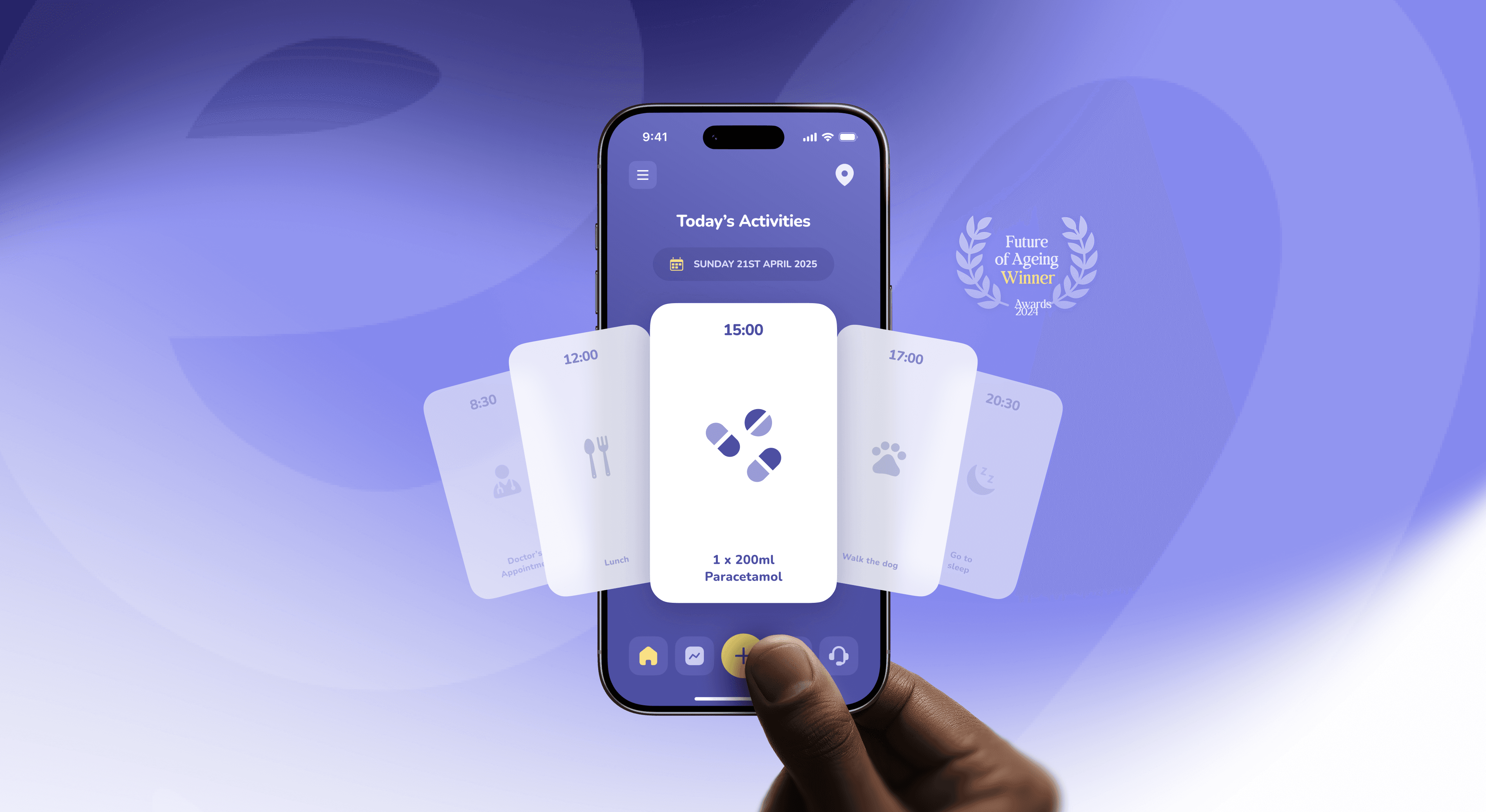
How to design apps for older adults that are accessible and dignified, not patronising. Principles, a swap table and lessons from the Elli Cares app.

Energy investors read a climate deck differently. What they look at first: technology readiness, unit economics, real installs and impact with a method.

Before a hospital takes the meeting, IT, procurement and clinicians check your site. A checklist of what they look for and how to pass.

Patients want independence, carers want reassurance. How to design one health app that serves both without turning care into surveillance.
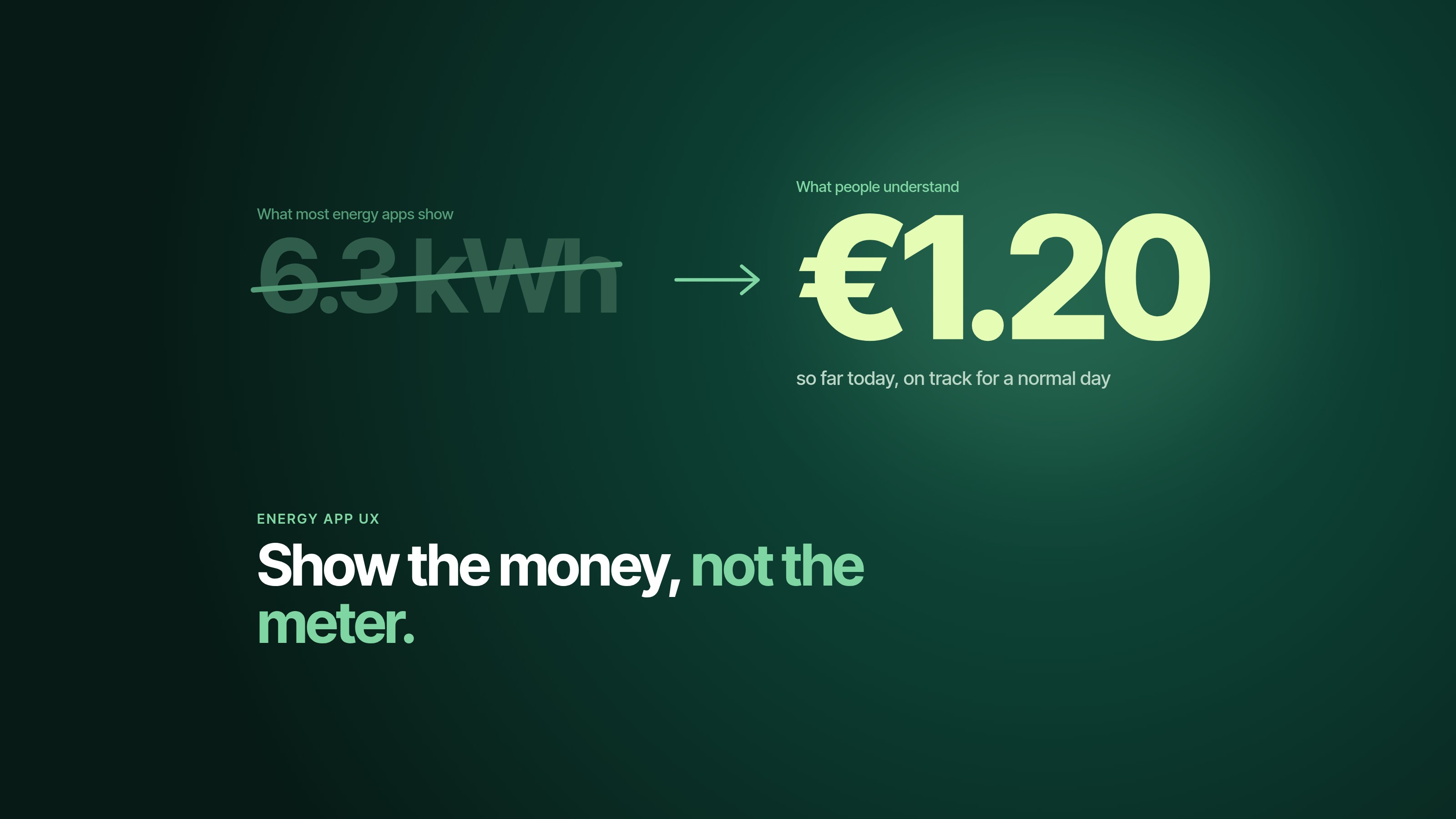
People underestimate their energy use by 2.8 times. Six UX patterns that make energy management apps clear, useful and worth opening twice.

Eight design principles for apps used by people with dementia or cognitive impairment, from the studio that redesigned the Elli Cares app.

Researchers tested nine ways to get cited in AI answers. Quotes, statistics and sources won. Keyword stuffing lost. Here’s what it means for your site.

Most renewable energy brands look the same from two metres away. A five-step way to brand a clean energy startup that people remember, from the studio behind Cubee.

Seven questions that separate a real HealthTech design partner from a nice portfolio, with what good answers sound like and the red flags to watch.

Most founders do not pick bad design agencies, they pick the wrong type. The three kinds of agencies, the red flags, and how to match the partner to the job.

More SaaS deals are decided on /pricing than on /. Why most pricing pages underperform, and the six-question audit that fixes them.

The rule that lets a SaaS product feel simpler as it grows: every release adds and removes. Here’s how the best teams enforce it.

Most startup websites explain too much. The 8-second test, four cuts and a simple rewrite framework that make a homepage hero actually convert.

Most founders treat HIPAA, MDR and accessibility as a tax on design. The teams that ship cleanest treat regulation as the brief. Here's the pattern.

A €60/hr freelancer can cost more than a €130/hr studio. The napkin maths on hidden costs and reworks, and when a freelancer is the right call.

The 12-point audit we run on every SaaS dashboard before a redesign, what good looks like and the five questions to ask your team. Steal it.
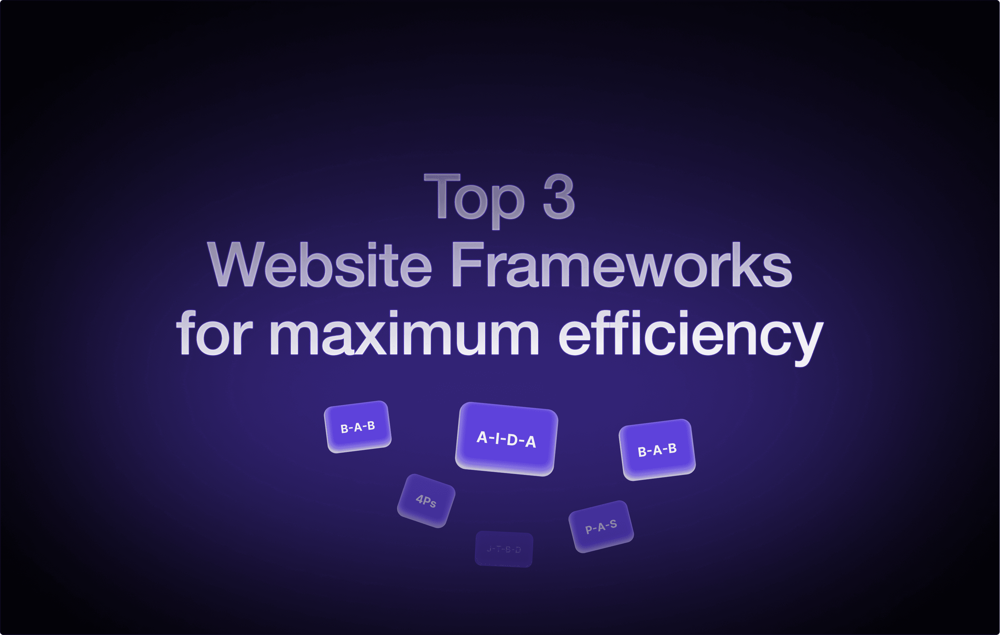
AIDA, PAS, BAB and FAB: the SaaS landing page structures that convert, why they work and how to match each one to the story your product tells.

Most design agencies look the same in a portfolio. How to start from the outcome, match the agency type to the job and spot the right SaaS partner.

A 2026 shortlist of top web and product design agencies in Europe, with their budgets, specialties and how to read the list before you pick one.

Our AI Meeting Assistant design made Dribbble’s Best Shots of 2026. How we rethought meetings and designed an AI experience that feels effortless.

Dribbble Select named Dtail Studio one of its top web and UI/UX design agencies for 2026. What the selection looks at and the work that got us picked.

The biggest SaaS breakthroughs often come from minds that work differently. How autistic, ADHD and dyslexic thinkers shape better products.

Most pitch decks don’t get a no. They get silence. The hidden killers inside a startup deck, three slides rewritten and the fixes that get replies.

A first-time founder’s guide to the pre-seed pitch deck: the five biggest challenges, what VCs look for and what to include before you hit send.

Pre-seed, seed and Series A investors want different things, so one deck won’t do. Why pitch decks fail and how to change yours as you raise.

The buttons, errors and microcopy that decide whether users trust your product. Eight UX writing rules, from keeping it human to clarity first.

Designing for a 1.5-inch screen isn’t shrunk mobile. Ten UI/UX rules for wearables, from the three-second rule to one-thumb use and less text.

Nobody changes the world alone. The mentors behind Jobs, Musk and Gates, and six rules of mentorship any founder can borrow.

You don’t build a brand, you discover one. A founder’s guide to finding it: start with stories, find your odd little magic and don’t lock it too early.

Eight client communication rules from a studio that has run hundreds of projects: set expectations, speak their language and be proactive.

Every landing page visitor silently asks three questions: where am I, what can I do here and why should I do it? How to answer all three, fast.

Six UX psychology principles that turn good SaaS into sticky SaaS, from the three-second rule to the Fogg Behavior Model, with examples from Notion.

How Adidas works with Lego, Gucci and Yeezy without losing the three stripes, and the lessons any startup can use to keep its brand sharp while scaling.

Six things that break when a SaaS startup scales before it’s ready: the product, the team, future-proofing, activation, data and culture.

Why voice assistants frustrate users, and the UX rules that fix it: clarity first, short but not robotic replies, confirmation and real conversation.

How to build a startup brand system that scales: fresh everywhere and recognisable anywhere, distinct without being rigid. The why and the how.

Vague audiences don’t convert, detailed personas do. How user personas shape a stronger brand, with a five-step process to build your own.

Times New Roman and Comic Sans don’t say the same thing. Six ways type talks, from serif vs sans-serif to bold vs light, and what yours says.

Error messages, empty states and button labels can feel like a digital hug or a digital downer. What microcopy does and how it changes your product.