
Designing tech for older adults that doesn’t feel like a pill box
How to design apps for older adults that are accessible and dignified, not patronising. Principles, a swap table and lessons from the Elli Cares app.
27 Oct 2026
Eight design principles for apps used by people with dementia or cognitive impairment, from the studio that redesigned the Elli Cares app.

Remove decisions, not features. Give each screen one job, use words alongside every icon, push contrast and touch targets well past the minimum, keep everything in the same place every time, and write reminders that never blame. Then design the family side with the same care, because trust between both users is what keeps the app on the phone.
More than 55 million people live with dementia, and nearly 10 million new cases are diagnosed every year, according to the WHO. Most of them still want to make their own tea, get to their own appointments and decide their own day.
Technology can help with that. Most of it doesn’t, because it was designed for people who remember where the settings menu is.
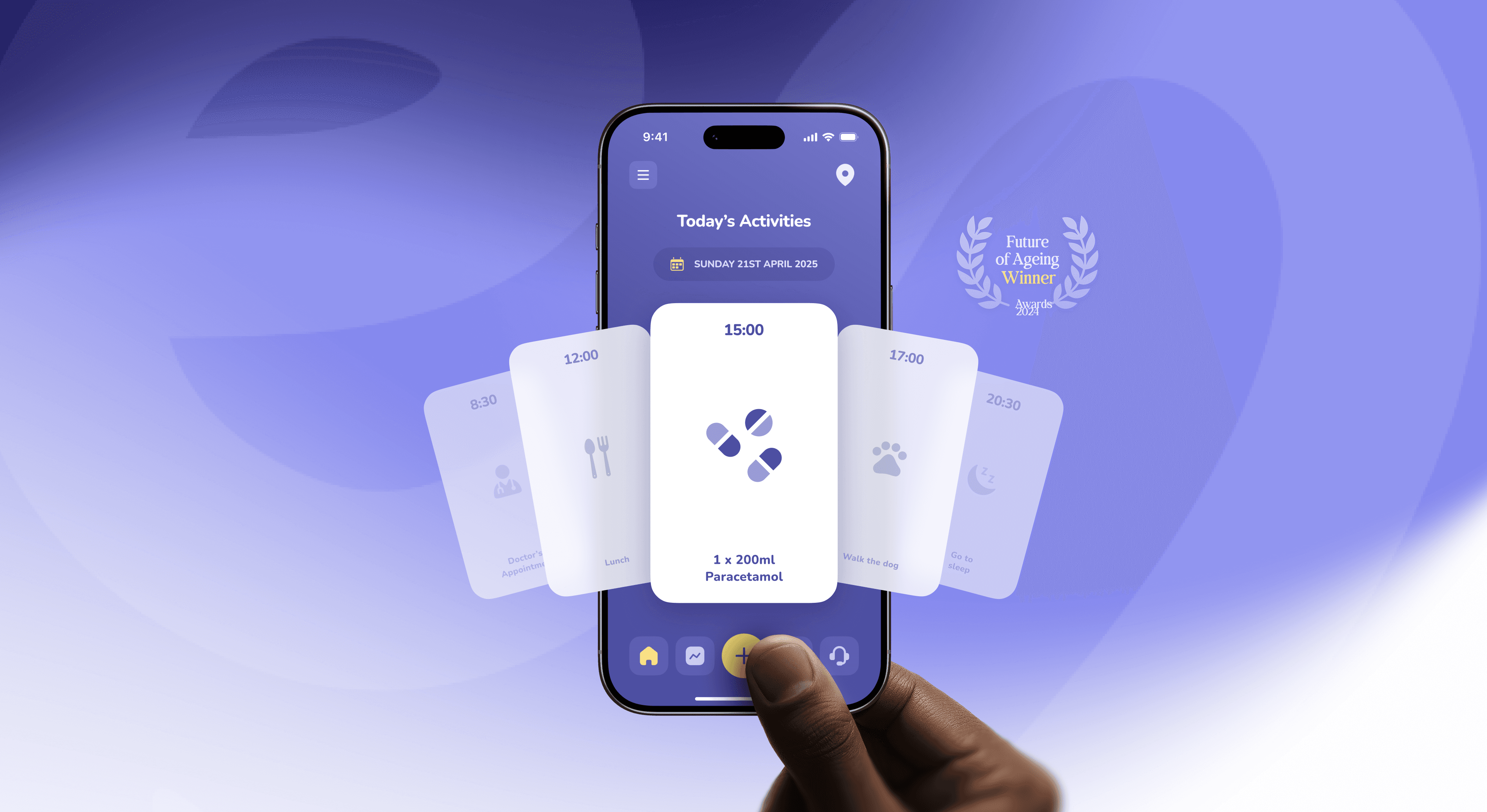
At Dtail Studio, a Barcelona design studio working with HealthTech and renewable energy startups, we redesigned the Elli Cares app (case study), which supports independent living for people with cognitive impairment and gives their families peace of mind. Here’s what we learned, and what we’d tell any team building for this audience.
Because the user’s abilities change, sometimes within the same day. Memory, attention, orientation and language can all be affected. An app has to work on a good morning and on a bad evening.
That rules out a lot of standard product thinking. Discoverable gestures, clever onboarding, features hidden behind a long press: all of it assumes a user who learns and remembers. Here, every screen has to make sense the first time, every time.
When Elli Cares came to us, the app carried high cognitive load, low contrast and unclear hierarchy. Nothing was broken, exactly. But medication reminders, schedules and location sharing all took more thinking than they should have. For most users that’s friction. For someone living with dementia, it’s a wall.
One job per screen. “Take your tablet” is a screen. “Take your tablet, see today’s plan and rate your mood” is three.
Words next to every icon. Icons rely on memory. Labels don’t. If an icon can’t carry a one-word label, it doesn’t belong.
Treat contrast minimums as the floor. WCAG 2.2 asks for 4.5:1 for body text. Older eyes and tired eyes need more, especially for the main action.
Big, forgiving touch targets. Apple recommends at least 44 by 44 points. For primary actions we go well beyond that and keep generous space between buttons, so a slightly shaky tap still lands.
Same thing, same place, always. Navigation never moves. Buttons don’t swap sides. No surprise modals.
Reminders that respect. “Time for your 9:00 tablet” with one big “Done” button. Never “You missed your medication” in red. Nobody improves their routine by being told off by their phone. Small words carry a lot here, which is why UX writing deserves as much care as the layout.
A calm visual language. Fewer colours, each with one meaning. No decorative motion competing for attention.
Make mistakes cheap. Undo on everything, confirmation only where an action can’t be reversed, and a clear way back home from any screen.
Make it visible and consented. The person being located should always be able to see that sharing is on and who can see it. Family members get reassurance, not surveillance.
This is the same pattern we wrote about in why regulation makes healthcare UI better: small, honest signals of who can see what. In dementia care, they matter even more, because trust is fragile on both sides.
Short and familiar. Sessions of around 20 minutes, ideally at home, on the person’s own phone, with a family member or carer nearby. Watch more than you ask, because “was that easy?” gets polite answers. Repeat the same tasks on different days, since a design that only works on good days doesn’t work.
Recruit carers separately as well. They use the same app for a completely different reason, and the two experiences have to fit together. We go deeper on that in one app, two users: designing for patients and the families who care for them.
Elli Cares is now used in 19 countries, was a joint winner of the 2024 Future of Ageing Award in the Technology Consumer category, and is nominated for the 2026 SilverEco and Ageing Well Awards. The credit belongs to the Elli Cares team. Design’s job was to stay out of their users’ way.
“Working with Dtail felt like having a senior team that truly cared about results and users.” Angela Edwards, CEO, Elli Cares
One job per screen: you can name the screen’s purpose in four words.
Labels: every icon has a visible word.
Contrast: key text and buttons go well beyond 4.5:1.
Targets: primary buttons are clearly larger than 44 by 44 points.
Consistency: navigation never changes position.
Tone: no reminder uses “missed”, “failed” or red alerts.
Recovery: every screen has a visible way back home.
Large text: the layout survives the phone’s largest text setting.
There’s no single number. Start body text larger than you would for a general audience, and make sure the layout still works when someone turns on the phone’s largest text setting. That second test catches most problems.
Not streaks, points or badges. Losing a streak feels like failure, and failure is the last thing this audience needs from a reminder. Gentle positive feedback works better.
Yes, carefully. The Elli App uses AI to personalise recommendations in its resource centre. Use AI where it saves the family effort, and be very cautious where it speaks directly to the person living with dementia.
The person. If they stop using the app, the carer has nothing to look at.
Open your app, turn your phone’s text size to the largest setting and try to complete your most important task with one hand. If anything breaks, you’ve found your next sprint.
Designing for older adults or people with cognitive impairment? We’re always happy to compare notes.
About the author. Slavena Vasileva is a partner and brand strategist at Dtail Studio, a senior brand and product design studio in Barcelona working with HealthTech and renewable energy startups. 16+ years, 300+ products, 5.0 on Clutch.
Sources: WHO dementia figures via NIHR Dementia Researcher · WCAG 2.2 · Inside Ageing on Elli Cares · Elli Cares case study
How to design apps for older adults that are accessible and dignified, not patronising. Principles, a swap table and lessons from the Elli Cares app.

Energy investors read a climate deck differently. What they look at first: technology readiness, unit economics, real installs and impact with a method.

Patients want independence, carers want reassurance. How to design one health app that serves both without turning care into surveillance.