SaaS
Slavena V.
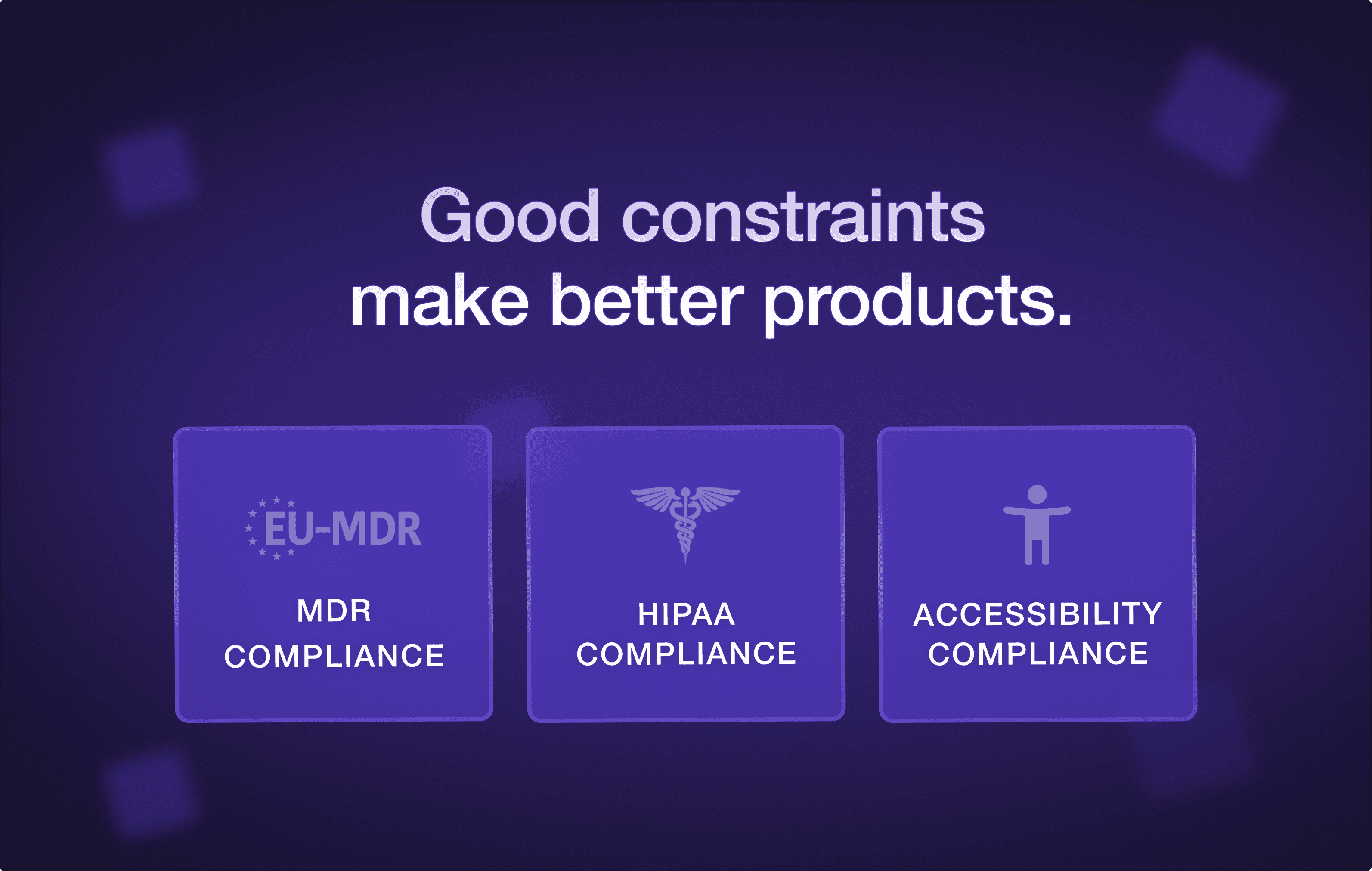
Why HIPAA, MDR and Accessibility make healthcare UI better, not worse
Regulation in healthcare doesn't slow good design down. It exposes whether the design was good to begin with. Teams that pre-bake HIPAA visibility, audit history, accessibility, and intended-use scoping into the first wireframe ship faster, sell to enterprise faster, and keep clinicians on the product for longer.
Most founders we meet treat healthcare regulation like a tax. The consent modal gets bolted onto the screen the night before launch. The audit trail gets crammed into a settings page nobody opens. The accessibility pass gets retrofitted in week eleven, and the launch slips by six.
We've shipped product UI inside HIPAA-covered platforms, FDA-adjacent clinical tools, and EU MDR-touching devices for the last seven years. Here's the pattern, and almost nobody believes it until they live it.
The regulated healthcare products that ship the fastest and look the best are the ones whose designers treated regulation as the brief, not the obstacle.
This piece is for the founder who is about to hire a designer for a healthcare product and is wondering whether to look for someone who has "done healthcare before." Short answer: yes, but not for the reason you think.
HIPAA, MDR, and accessibility: what each one is really asking
Founders often treat HIPAA, MDR, and accessibility as one bucket called "compliance." They are three separate briefs. They ask different questions, and they produce different UI patterns. Knowing which one is shaping a given screen is half the work.
HIPAA / HITECH (US).
What it is really asking: who can see this PHI, on what device, in what context, and is the access logged? Every HIPAA-relevant screen is fundamentally a visibility-and-audit question. The consequence is that "who is looking at this right now" and "what is being recorded" need to be first-class affordances, not buried in settings.
EU MDR / IVDR.
What it is really asking: if this software contributes to a clinical decision, can a regulator trace exactly what claim it made, to whom, under what conditions, and what its known limitations are? This is intended-use territory, the same ground the FDA covers with Software as a Medical Device. Scope discipline gets brutal. The home screen stops trying to be five products, because each "product" is potentially its own MDR classification.
WCAG 2.2 AA / Section 508.
What it is really asking: can someone using this product on the worst day of their week, tired, low-vision, on a cracked screen, with a screen reader, still complete the core task without help? The floor of "usable" rises for everyone. 16pt type minimum, 4.5:1 contrast ratios, keyboard-only navigation, semantic landmarks. The W3C WCAG spec treats none of it as optional, and the Nielsen Norman Group has spent two decades showing the worst-case user is also the average user, on an average day.
We have watched founders try to bargain with each of these. It never works. The bargaining is the source of the six-week launch slip. Treat the regs as the brief and the bargaining vanishes.
The 4 UI patterns that emerge from the constraints
Once you stop fighting the regulations, four UI patterns start to recur across every healthcare product we ship. None of them are unique to healthcare. They are just much sharper here, because the cost of getting them wrong is regulatory, not aesthetic.
1. The visibility receipt.
A small, in-context affordance that tells the user, clinician or patient, what is visible to whom right now, and that this view is logged. It looks like a chip in the page header that reads "Viewing as: Dr. Mehta, this view is recorded." Patients see a softer version: "your care team can see this, your insurer cannot." The byproduct is a level of trust most consumer products cannot manufacture at any budget.
2. History as a first-class object.
Audit trails get hidden in products built by engineers who treat them as a database requirement. We treat them as a product surface. The right pattern is a per-record history view any user can open and read, in plain language, with timestamps and actors. "Dose changed by Dr. Mehta at 14:02. Reverted at 14:04. Re-entered at 14:11." When history is visible to the people doing the work, errors get caught in minutes instead of in monthly QA reviews.
3. Scoped intended use, surfaced.
The clinical claim a product makes, what it is for, what it is not for, under what conditions, should be visible to the user, not hidden in a Terms-of-Service PDF. In MDR products this is often a footer line on the relevant view: "This tool supports, but does not replace, clinical judgement in adult Type 2 diabetes patients." It looks small. It is the difference between MDR Class I and Class IIa.
4. The dignified error state.
Healthcare errors are not "oops." They are clinically meaningful, sometimes legally meaningful, and they happen to a real person on a real day. The pattern is plain language, a clear next action, and a fallback path that doesn't leave the user stranded. "We can't show your record right now. Your care team has been notified. Call this number if you need help today." Consumer apps can afford to be cute in error states. Healthcare apps cannot.
These four patterns, applied honestly, produce a product that feels calmer than a consumer app. They are also the same instinct behind why the best SaaS products feel simpler as they grow, and they are what enterprise procurement is actually looking for when they say "we want it to feel mature."
Where most healthcare products break: auth, audit logs, and error states
Across the products we have audited, three areas account for the majority of compliance findings, user complaints, and clinician trust failures. If you only have time to focus on three, focus here.
Auth and session.
The single most common failure is shared workstations in clinical settings. A nurse logs in, leaves to take a call, the next clinician walks up. Did the session lock? Did the new clinician inherit the old session's permissions? Is the audit log about to attribute the next 12 actions to the wrong person? If your auth flow doesn't have a strong opinion about device class, session length, and shared-workstation behaviour, you have an unbounded liability, not a UX problem.
Audit logs.
Nine out of ten audit-log views we see are unreadable dumps. They filter by user, by timestamp, by action type. Never by clinically meaningful question. A great audit log lets a compliance officer ask "show me every PHI access for patient X in the last 30 days, grouped by clinician, with the reason for access." A bad one makes them export to CSV and write a SQL query. The good version is roughly the same engineering cost. It is a product decision, not a database one.
Error states.
Every healthcare product we audit has at least one critical-path error state that says "Something went wrong. Please try again." That is acceptable for a B2C app where the user can shrug and refresh. It is not acceptable when the user is a clinician trying to chart a medication change for a deteriorating patient. The fix is not technically hard. It is a product attention problem. Error states get designed last, by whoever is left in the office on Friday.
If a designer hands you a flow that doesn't have an opinion on auth, audit, and errors, they have designed the happy path. The happy path is the easy 60% of healthcare UI. The other 40% is what gets you sold into the hospital system.
What it looks like when a designer gets it
We've been the second designer on enough healthcare products to recognize the pattern. Here is how to tell, in the first two weeks of a partnership, whether the person you have hired understands regulated UI.
They ask "what is logged" before they ask "what is hidden."
They want to read the intended use statement before they design the dashboard.
They draw consent into the flow, not after the flow.
They sketch the audit screen with the same care as the home screen.
They ask "who can see this view, on what device, in what setting" before "what does the user want here."
They run the type stack at 16pt minimum and show you the screen at 200% zoom in week one, without being asked.
They have an opinion about the difference between a clinician's UI and a patient's UI in the same product.
If you are getting "let us make it look modern and clean first, we will layer compliance on after," you have hired someone who is going to cost you a six-week launch delay and a rebuild. Politely keep looking.
The shift we are watching across funded healthcare teams in 2026
For the first time, healthcare founders are treating regulated UI as a competitive moat, not a cost center. The teams that took compliance seriously from day one have the cleanest product, the fastest enterprise sales cycles, and the most clinician trust on launch day. The teams that treated it as a tax are still rebuilding.
If you are at the start of that decision, the question is not "can we afford someone who knows healthcare." It is "can we afford the year we will spend retrofitting if we don't?"
If you are hiring your first designer for a healthcare product
We have been the design partner on HIPAA-covered platforms, clinical workflow tools, and patient-facing care products since 2018. We won't pretend regulation is fun. We will tell you, in 30 minutes, whether your product is at the stage where bringing in a healthcare-fluent partner pays for itself inside two quarters.
→ Talk to dtail about your healthcare product at dtailstudio.com
Q: Does HIPAA prohibit specific UI patterns?
A: HIPAA doesn't prohibit UI patterns directly — it prohibits unauthorised access to PHI. But that has hard UI consequences: any screen showing PHI needs an authenticated, audited session; PHI cannot leak into URLs, page titles, analytics events, or shareable links; and consent must be specific to the data being shared, not a blanket acceptance. The pattern that breaks teams most often is the 'shareable view link' that quietly exposes PHI to anyone with the URL.
Q: What's the difference between HIPAA and HITRUST?
A: HIPAA is US law and sets the floor. HITRUST is a private certification framework that maps HIPAA, NIST, GDPR, and other standards into a single audit. Hospitals and large payers increasingly require HITRUST CSF certification on top of HIPAA compliance, which raises the documentation burden but doesn't change the underlying UI patterns much. Design-wise, build for HIPAA — HITRUST evidence is mostly process and engineering, not design.
Q: Does my healthcare product need to be MDR-certified?
A: Only if it makes a clinical claim — that is, if the software contributes to diagnosis, prevention, monitoring, prediction, prognosis, treatment, or alleviation of a disease or condition. A patient-facing record viewer is usually not a medical device. A tool that calculates dosage or flags a result as 'abnormal' usually is. If you are unsure, you need a regulatory consultation before the design starts, because MDR class shapes the UI.
Q: How is accessibility different for healthcare UI?
A: The floor is higher and the use cases are more extreme. WCAG 2.2 AA is the standard, but healthcare adds Section 508 (for US federal projects), state-level requirements, and the practical reality that your users include people with temporary impairments (a clinician on a 14-hour shift, a patient post-surgery). In practice: 16pt minimum body type, 4.5:1 contrast minimums, full keyboard nav, semantic landmarks, screen-reader-friendly form labels, and no information conveyed by colour alone.
Q: Does Dtail Studio work on regulated healthcare products?
A: Yes. We've shipped UI for HIPAA-covered platforms, EU MDR-adjacent clinical tools, and accessibility-mandated patient portals since 2018. We start every healthcare engagement with the six-question audit described above — if your project isn't ready, we'll tell you what to settle first. Book a free 30-minute consult if you'd like to scope a regulated build.


