
AI SaaS product design: AI features B2B buyers trust
AI SaaS product design that B2B buyers trust: where AI features lose deals, and the sources, undo, limits and admin screens that win them back.
28 Oct 2026
AI health app design for founders: where AI belongs, how to show its source and certainty, when a person takes over, and what to leave out.

Good AI health app design puts AI where it saves patients effort, then shows its work: what it looked at, what it thinks, how sure it is and what to do next. A person is always one tap away. Leave diagnosis, open chat and silent automation out of the first release, and never make “AI” the headline.
Your patients are already asking AI about their health. In a KFF poll from March 2026, about a third (32%) of US adults said they’d turned to AI chatbots for physical or mental health advice in the past year. Among adults who hadn’t, trust in it was about one in five (18%).
So your users arrive in two camps. Some expect AI in your app. Others will leave the moment a machine seems to be guessing about their body. You get to design for both, on the same screen, and it starts with asking what the AI is actually for.
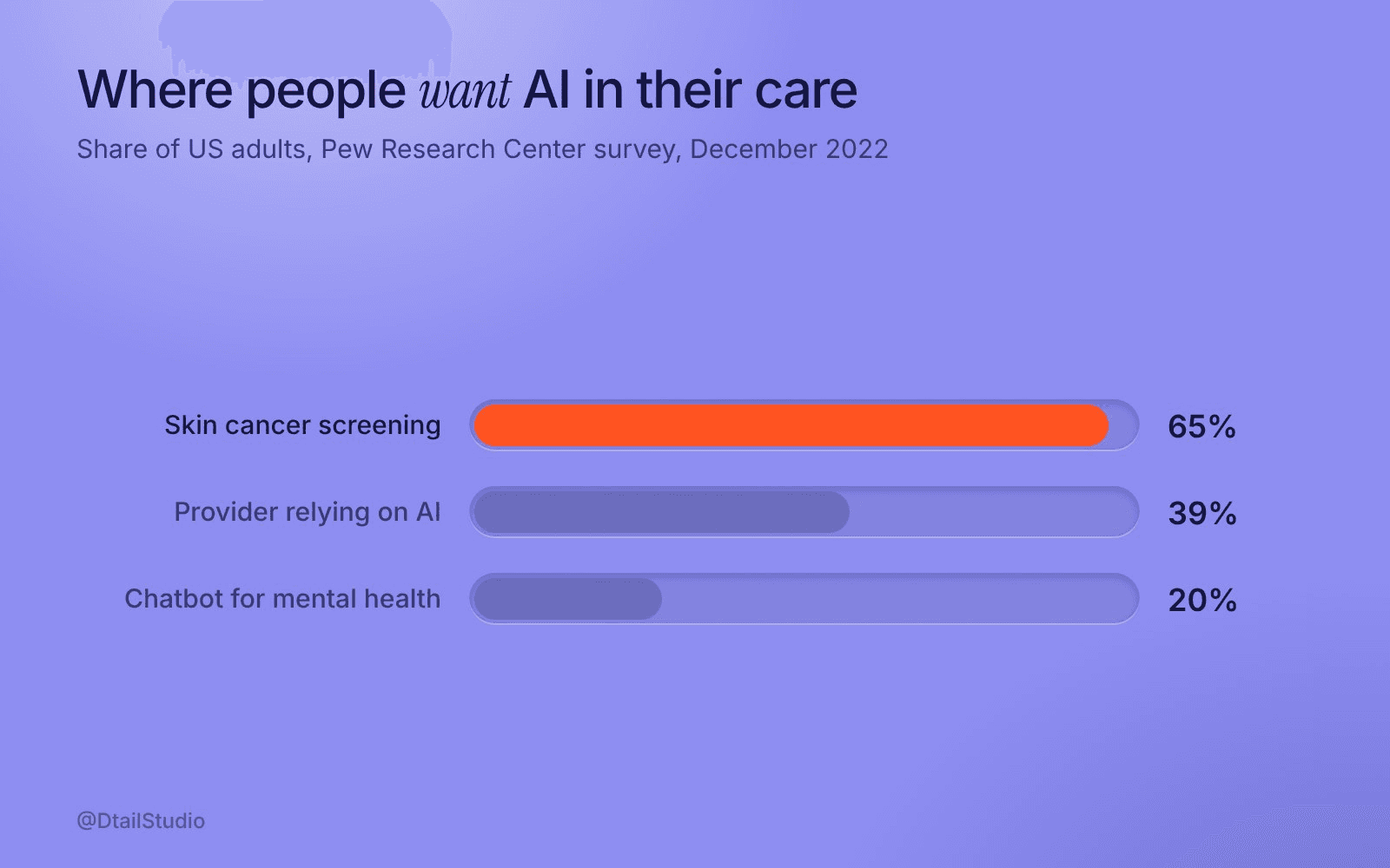
Share of US adults who would want, or feel comfortable with, each use of AI in their own care. Source: Pew Research Center, 2023 (survey of 11,004 adults, December 2022).
In the chores around care, and out of the decisions about it. Summarising readings, sorting messages for a nurse, drafting replies, spotting patterns for a person to check. Real time saved, and nobody bets their health on it.
Pew Research Center’s 2023 survey shows where people draw the line. 65% of Americans said they would definitely or probably want AI used in their own skin cancer screening, where a clinician still checks the result. Only 20% would want to use an AI chatbot if they were looking for mental health support. People are happy for AI to help a professional look closer, and much less keen on it standing in for one.
A quick test for each feature idea: if the AI gets it wrong, who notices first? If it’s a nurse, before the patient sees anything, build it. If it’s the patient, three days later, wait.
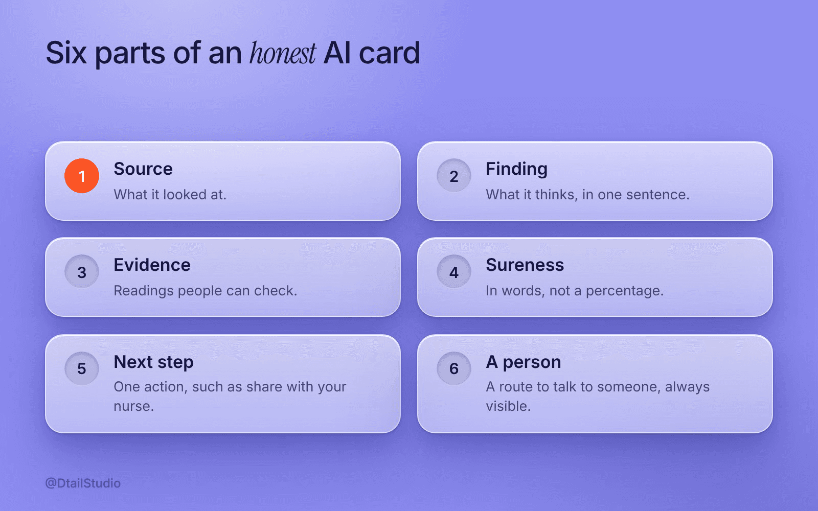
Illustrative AI card: source, finding, evidence, sureness, next step and a person. Framework by Dtail Studio.
Every AI output should answer five questions on the same card, in plain words. Use this checklist on every AI screen:
What did it look at?
“Based on your last 14 readings” beats “based on your data”. A source turns a claim into something people can check.
What does it think?
One sentence. If it needs a paragraph, the feature is doing too much.
How sure is it?
In words: “likely”, “possible”, “not enough data yet”. Then what would make it surer.
What should I do next?
One action. Share it with your nurse, log another reading, or ignore it.
Who can I ask?
A route to a person, always visible and never buried in settings.
We’d skip the confidence percentage for patients. “87% confident” reads like an exam grade, and nobody knows what to do with the other 13%. Words plus a next step lead somewhere. Clinicians may still want the number.
Before the AI gets out of its depth. Set the handover rules before anyone writes a prompt, and design them as real screens rather than a disclaimer.
Typical triggers (illustrative, your clinical team sets the real ones) are a red-flag symptom, a question about medication, low confidence, the same question asked twice, or a simple request for a person. When one fires, the app says who will reply and roughly when, and passes the conversation along.
People already use AI as a step before care. In the KFF poll, about one in six (16%) adults said they used AI to help decide whether to see a doctor, and about six in ten (58%) of those who used it for physical health advice later followed up with a doctor or provider. Design for that moment and let people take the summary with them.
Say what the feature does for the patient, and say plainly, where it happens, that software did it. “AI-powered insights” only tells patients a machine is involved, which is exactly the part they worry about. “A summary of your week, so your appointment goes faster” tells them why to care.
Don’t hide it, though. In a 2025 Duke study in JAMA Network Open, 1,455 members of a patient advisory group rated replies to portal messages. They were slightly less satisfied when told AI had drafted the reply, and the authors still concluded that disclosure should be maintained. Our reading is to label it without leading with it. A small, consistent line like “Drafted by software, checked by your care team” does more for trust than a sparkle icon, which has quietly become the universal symbol for “we’re not sure either”.
Marketing too. In the Pew survey, three-quarters of Americans said their bigger worry was that providers will move too fast with AI. A homepage that shouts “AI” feeds exactly that.
Anything where a wrong answer reaches the patient before a person does. That usually means:
No diagnosis or treatment advice.
Suggest talking to a clinician instead, and make that easy.
No open-ended chat.
A blank box invites questions you can’t answer safely. Offer a few specific ones.
No silent actions.
The AI can suggest moving a reminder. The patient confirms it.
No data you don’t need.
77% of the public told KFF they’re concerned about the privacy of personal medical information given to AI tools. Ask for less, and say why when you ask.
One regulatory note. Features that diagnose can turn your app into a regulated medical device, and in the EU, from 2 August 2026, people must be told from the first interaction when they’re dealing with an AI system (European Commission). For the rest of the scope, see what a digital health MVP should include. If people are already drifting away, read why patients stop using health apps before you add AI.
We’d start with the jobs people do, and get to the model later. For an AI feature in a health app, that usually means:
A task map.
Every chore patients and staff do, marked by effort and the cost of a wrong answer. AI goes where effort is high and mistakes are cheap to catch.
Handover rules, drawn as screens.
With your clinical lead: what triggers a person, who replies, what the patient sees meanwhile.
One AI card and a word list.
A reusable component for source, answer, sureness, next step and a person, worded the same way everywhere.
Tests with real patients.
Can people tell what the AI did and what to do next, without help?
Bring your feature list, some sample model outputs and the person who owns clinical safety. More on how we work.
For Elli Cares, an app for people living with cognitive impairment and their families, the problems were high cognitive load, low contrast and an unclear hierarchy. We simplified the flows and moved to a high-contrast UI with a calm visual language (case study). People under strain read less. An AI suggestion lives by the same rules: short, calm and obvious about what to do next.
Should we call ourselves an AI company?
To investors, show what the AI does and the evidence that it works. Our post on HealthTech pitch deck design covers that. To patients, lead with the outcome and label the AI where it acts.
Should we tell patients when AI is involved?
Yes. The Duke study found the drop in satisfaction was slight. We’d rather lose a little than be caught hiding it.
Who designs the handover rules, designers or clinicians?
Both, in one room. Clinicians set the triggers, designers make sure the patient understands what happens next.
Screenshot one AI output from your product and show it to someone outside the team. Ask them what it looked at, what it thinks, how sure it is, what they should do now and who they could ask. Every answer missing from the screen is a fix for your next sprint.
If you’d like a second pair of eyes on your AI features, let’s talk.
About the author: Rori Thompson is a Content Writer at Dtail Studio and writes about product design, UX and the details that make an app easy to use.
Sources: KFF Tracking Poll on Health Information and Trust (2026), Pew Research Center, AI in health care (2023), Cavalier et al., JAMA Network Open (2025), European Commission, AI Act transparency obligations
AI SaaS product design that B2B buyers trust: where AI features lose deals, and the sources, undo, limits and admin screens that win them back.

When does a SaaS website redesign pay off? Five signs to check, what to fix first, and when a full redesign wastes a quarter.

Digital health app design for Europe and the US: one core product with local layers for language, units, dates, consent and trust cues.