

Healthcare app UX audit: a 10-minute self-check
A 10-minute healthcare app UX audit: five quick checks to find out if your health app is too complicated, and what to fix first.
21 Oct 2026
Digital health MVP design for founders: one user, one job, one proof point. What a HealthTech MVP must include and what can wait until after the pilot.

Digital health MVP design should cover one user, one job and one proof point: the smallest product that lets a real patient, carer or clinician do the thing you exist for, safely and without help, and that gives a pilot site or investor evidence it works. Everything else, including most dashboards, settings and second audiences, can wait.
Health founders tend to build too much, and for good reasons. The hospital wants an admin panel. The investor asked about AI. Your clinical adviser wants every edge case covered. Before long, the MVP has a roadmap of its own.
Meanwhile the main reason startups fail hasn’t changed much. CB Insights looked at 431 venture-backed companies that shut down since 2023. Running out of money came up in 70% of cases, but CB Insights calls that the final cause, not the root problem. Poor product-market fit came up in 43%.
A good health MVP usually gets better by losing features. Here’s a cut list to work from.
It’s for learning whether one group of people will use your product for one job, again and again. It isn’t a smaller version of the full product. It’s a test with a user interface.
That matters because health apps are easy to download and easy to forget. Back in 2017, the IQVIA Institute reported that 85% of health apps had fewer than 5,000 downloads. And getting downloaded is only the start: in a 2019 JMIR study of mental health apps, median retention after 15 days was 3.9%.
So the question for your MVP isn’t “what can we build?” It’s “what’s the smallest thing that proves people come back?” Our post on why patients stop using health apps after week two covers the second half of that question.
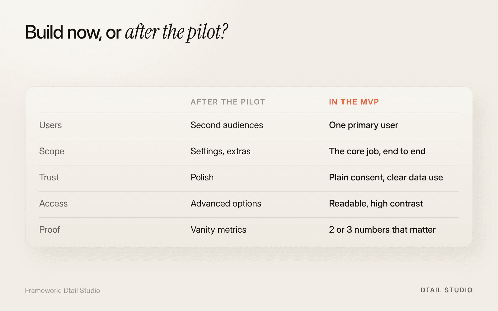
What goes in a digital health MVP, and what waits. Framework by Dtail Studio.
Five things, and they’re not all features. The figure below sets them against what can wait.
One primary user.
The patient, the carer or the clinician. Pick one to design for first, even if others will touch the product.
The core job, end to end.
From the first open to the moment the user gets what they came for, with no dead ends and no “coming soon”.
Trust basics.
Plain-language consent, clear data use, who’s behind the product and how to get help. In health, trust is part of the MVP, not a later polish.
Accessibility basics.
Readable text, enough contrast, large touch targets. Your first users may be older or unwell.
A way to measure.
The two or three numbers that tell you if it works, such as completion of the core task and return visits.
Anything that serves a second audience, a future feature or your own team’s convenience. Most of these will be needed eventually. None of them prove your idea.
Our point of view, and one founders don’t always want to hear: a clinician dashboard is rarely MVP material. If clinicians are not your primary user, give them a simple export or a weekly summary for the pilot. Build their dashboard once you know which numbers they actually look at.
Other things that can wait: deep settings, gamification, a full design system, a second platform, and AI features that are there because someone asked about AI in a pitch. If you need them for the story, a well-made prototype in the deck does the job. Our post on whether your pitch deck is killing your raise has more on that.
Find out early whether your product could count as a medical device, because it changes what “minimum” means. If it does, safety-related flows and documentation can’t be cut. That’s one sentence of regulation, and your regulatory adviser owns the rest. We’ve written about why regulation can make healthcare UI better rather than slower.
We’d start by deleting things together. For a HealthTech MVP, that usually means:
Write the one-sentence job.
“A carer can see today’s medication and confirm it was taken.” If it takes two sentences, it’s two products.
Sort every feature into now or later.
Using the figure as a guide. Be ruthless with anything that serves a second audience.
Design and test the core flow.
Prototype it and test it with five real users before building.
Define the pilot numbers.
Agree with the pilot site what success looks like before launch, not after.
Bring your feature list, your pilot plan and the one thing you need to prove by your next raise. More on how we work. If budget is the question, our post on healthcare app design cost explains the drivers.
The Elli Cares app for people living with cognitive impairment and their families is a good example of focus: reminders, mood tracking, scheduling, location and caregiver communication, each designed to be understood at a glance. See the case study.
How long should a digital health MVP take to design?
It depends on the users and the evidence you need. Scope the core job first, and the timeline follows.
Should the MVP work on iOS and Android?
Start where your users are. For many patient groups that’s one platform, or the web.
Do investors expect an MVP before Series A?
Most will want real usage data by then. A focused product with clear numbers beats a broad one with vague ones.
Can we use no-code for a health MVP?
Sometimes, for a test. Check data protection and hosting with your adviser before any real patient data goes in.
List every feature on your roadmap on sticky notes. Draw two columns: “Proves the one job” and “Everything else”. Move each note once, without discussion. If the first column has more than seven notes, you’re not building an MVP yet.
If you’d like help with the cutting, let’s talk.
About the author: Rori Thompson is a Content Writer at Dtail Studio and writes about product design, UX and the details that make an app easy to use.
Sources: CB Insights, The top reasons startups fail (2026), IQVIA Institute press release (2017), Baumel et al., Objective User Engagement With Mental Health Apps, JMIR 2019
A 10-minute healthcare app UX audit: five quick checks to find out if your health app is too complicated, and what to fix first.

Hand-picked design studios for 10 industries, from SaaS and HealthTech to real estate and education, with real projects you can check.

Seven healthcare UX design agencies in Europe with real health case studies, how we chose them and how a founder should compare them.