Energy installer app design: the screen nobody demos
Energy installer app design decides whether your product gets fitted and recommended. What installers need on site, and how to design for it.
23 Oct 2026
HealthTech pitch deck design: show who pays, your evidence, a one-line regulatory path and how patient data is handled. What investors look for.

Good HealthTech pitch deck design makes five things obvious that a generic SaaS deck can skip: who pays versus who uses, the evidence so far, the regulatory path in one plain line, pilot or clinical traction, and how patient data is handled. Design the evidence slide first, then build the rest around it.
An investor opens your deck on a Tuesday evening. DocSend’s research found that investors spend less than 3 minutes reviewing pitch decks (DocSend, 2025). In a health deck, most of those minutes go on a question a SaaS founder rarely hears: who exactly pays for this, and why would they?
The money is there, but it’s picky. US digital health startups raised $7.4B across 244 deals in H1 2026, and 20 mega deals took 45% of all capital invested (Rock Health, 2026). By the end of Q3 2026, the year-to-date average deal size had climbed to $31.0M. Fewer, bigger cheques. Everyone else competes for the rest.
This post covers only what’s different about health. For general deck advice, read what investors want to see at every stage and whether your pitch deck is killing your raise.
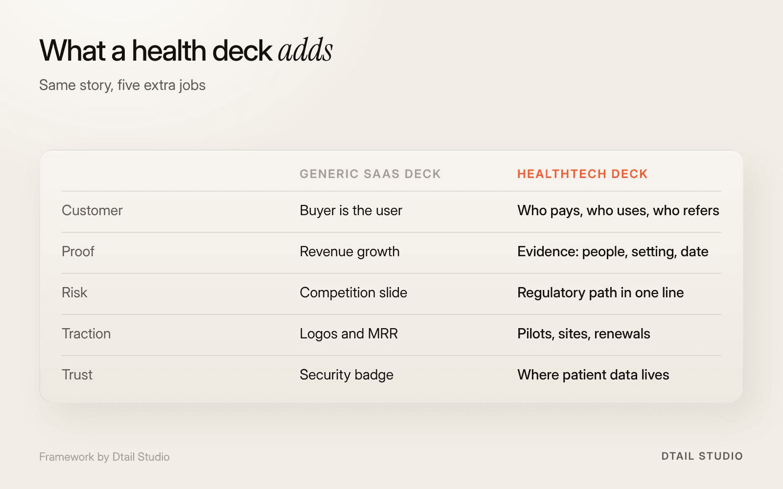
Five things a HealthTech deck has to make obvious. Framework by Dtail Studio.
Five things that a SaaS deck can leave implicit and a health deck can’t. In SaaS, the buyer is usually the user and traction means revenue. In health, the money, the use and the risk sit with different people. Each one needs a slide, or a clear line on one, and each has a design job.
Who pays, who uses.
A patient uses it, a clinician recommends it, an insurer, employer or hospital pays. Draw it as three boxes and two arrows, not a paragraph.
Evidence so far.
Pilot results, a study in progress or published outcomes. Say which, with the number of people and the date, in the largest type.
The regulatory path, in one line.
For example: “Wellness product, no clearance needed” or “Medical device software, submission planned next year”. Put the detail in the appendix.
Pilot or clinical traction.
Signed sites, active users, renewals. A paid pilot with a named partner beats a long waitlist. A timeline shows the next milestone.
Data and trust.
Where patient data lives, who can see it and which rules apply. One line and one diagram, not a wall of compliance logos.
The figure below compares the two decks slide by slide.
The evidence slide. Everything else in a health deck is arranged around it. Most founders design in order: cover, problem, solution, and the evidence slide gets whatever energy is left on a Sunday night. We do it the other way round.
The reason is where the risk sits. Health investors are looking for proof that the product changes something measurable, and Rock Health describes the sector as embracing “a renewed focus on measurable outcomes” (2026). If your evidence is thin, the deck should say so plainly and show what the next study will prove. If it’s strong, the problem slide can be shorter, because the result does the arguing.
Our second opinion: a real product screenshot matters more than your logo slide. Health investors have seen plenty of beautiful brands sitting on top of a Figma file. A screen showing what a patient or nurse actually taps, with real copy, says “this exists” faster than any tagline. If the product is early, show the one flow that works.
One plain line each in the main story, and the detail in an appendix. Investors need to know whether you’re regulated, where you are on that path and what it means for time and money. They don’t need the paperwork on slide six.
If you’re not sure which side of the line you’re on, the FDA’s Digital Health Policy Navigator walks through whether a software function may be a medical device. In Europe, the same question falls under the Medical Device Regulation. Either way, write the answer as one sentence an investor can repeat to their partners on Monday.
Data works the same way. Say where patient data is stored, who can see it and whether GDPR, HIPAA or both apply. Then show the product side of it: the consent screen is often more convincing than a security slide. Our post on HealthTech onboarding, consent and permissions covers what good looks like.
One of our clients, OXOS, makes the MC2 portable X-ray system, and its FDA clearance was expanded to paediatric imaging in March 2026. That’s what a regulatory line looks like once you have one: a fact and a date, no adjectives.
Before your first institutional round, often yes. Once you have evidence to present, get help. At pre-seed, a clean template, honest numbers and one real product screen will do more than a polished deck around a product that doesn’t exist yet. Spend the design money on the product.
At seed and Series A, the deck has to carry evidence, a payer model and a regulatory line, and be understood in under three minutes by someone who isn’t a clinician. That’s an information design problem, and it’s where a designer earns their fee. If the raise also needs a brand and website that tell the same story, our funding round packages cover all three.
We’d start with the two slides that carry the risk, then build the story around them. For a HealthTech raise, that usually means:
Evidence and payer slides first.
We agree what you can prove today and who pays, then design those two slides before anything else.
Product screens that look real.
We design or tidy the screens you show, so the product slide matches the app an investor will try after the call.
A one-line regulatory and data slide.
Plain sentences in the main story, with the detail in an appendix for diligence.
Two versions of the deck.
One to send, which reads on its own, and one to present, with far less text.
Bring your current deck, your latest pilot or study numbers, the payer you’re targeting now and a short note on how patient data is handled. More on how we work.
Who can design a pitch deck for a digital health startup?
A designer or studio that has worked on health products and can show decks next to the product screens they designed. Ask to see how they handled an evidence slide. If they only show covers, keep looking.
How many slides should a HealthTech deck have?
About as many as any other deck. DocSend found that most pitch decks are roughly 20 pages long, with about 50 words per slide. Health adds content, so move the detail into an appendix rather than adding slides to the story.
Should we show study results if the study is small?
Yes, labelled clearly: number of people, setting, date and what you measured. A small, clear result beats a large, vague claim.
Do we need a different deck for European and US investors?
Usually the same story with a different regulatory line and payer slide. Who pays for care is the part that changes most between markets.
Send your deck to a smart friend who doesn’t work in health. Give them three minutes, then ask three questions: who pays for this, what’s the evidence so far, and does it need approval to sell? Any question they can’t answer is the next slide to redesign. Start with the evidence one.
If you’d like a second pair of eyes on your deck before you send it, let’s talk.
About the author: Alma Johnson is Content Lead at Dtail Studio and writes about brand strategy, positioning and how founders explain what they do.
Sources: DocSend, Pitch deck research: what investors look for (2025), Rock Health, H1 2026 funding and market overview (2026), Rock Health, Q3 2026 market update (2026), US FDA, Digital Health Policy Navigator, European Commission, Medical Devices Regulation overview
Energy installer app design decides whether your product gets fitted and recommended. What installers need on site, and how to design for it.

A 10-minute healthcare app UX audit: five quick checks to find out if your health app is too complicated, and what to fix first.

Digital health MVP design for founders: one user, one job, one proof point. What a HealthTech MVP must include and what can wait until after the pilot.