Wellness brand design agency guide: clinics and consumers
A wellness brand design agency view on selling to clinics and consumers: what changes in tone, proof and packaging, and what must stay the same.
4 Nov 2026
Solar company branding that earns trust: the five things US homeowners check before they call, and how your brand and website should answer each.

Solar company branding works when it answers a homeowner’s doubts before the first call: recent reviews, warranties in plain words, photos of real installs, honest pricing and the name of whoever will be on the roof. In solar, the brand is mostly proof. A clear logo helps. A photo of your actual crew helps more.
Plenty of homeowners think about solar and never get as far as a quote. In Pew Research Center’s figures, 7% of US homeowners have installed panels and 28% say they’re seriously considering it. That gap is full of people who are interested and not yet convinced.
Part of what holds them back is the industry’s reputation, which tends to knock on the door before you do. The CFPB found that hidden dealer fees on solar loans often push the cost 30% or more above the cash price, and listed exaggerated savings claims among the risks. Your future customer may well have read that.
So when they open your website, they aren’t admiring the gradient. They’re checking whether you’re one of the good ones.
It needs to lower the risk a homeowner feels before handing you their address, their roof and a big financial decision. Name, logo and colours still matter, because they make a small company look established. But they’re the frame. The proof goes inside it.
The interest is there. In EnergySage’s H1 2026 marketplace report, 76% of homeowners shopping on its platform said they were interested in battery storage, the highest it has recorded. Only 31% of quotes included one, which EnergySage puts down mostly to upfront cost. Someone who wants something but hesitates over the price needs more reasons to trust the seller, not fewer.
Still at the identity stage? Our earlier post on how to brand a clean energy startup covers name, symbol and colour. This one is about what the brand has to prove once someone is shopping.

How US consumers use reviews of local businesses. Source: BrightLocal, Local Consumer Review Survey, February 2026.
Five things, roughly in this order: reviews, warranties, real install photos, pricing and who installs.
Reviews.
In BrightLocal’s 2026 survey of US consumers, 97% read reviews for local businesses, 74% only care about reviews from the last three months and 89% expect the owner to reply. Show recent reviews with dates, link to where they live and reply to every one, especially the grumpy ones.
Warranties.
A long warranty is only as good as the company behind it. List product, performance and workmanship cover as separate lines, say who backs each one, and what happens if you’re no longer around.
Real install photos.
A stock roof under a perfect sky proves nothing. Show your own installs, tagged by town, with roof type, system size and the battery on the garage wall.
Plain pricing.
Show a typical price range, what’s included, and the cash price next to the financed one. Explain how you estimate savings. Our post on why nobody understands a kilowatt-hour has ideas.
Who installs.
Homeowners want to know whether the people on the roof work for you. Show names, faces, licences and certifications such as NABCEP. If you use partner crews, say so and name them.
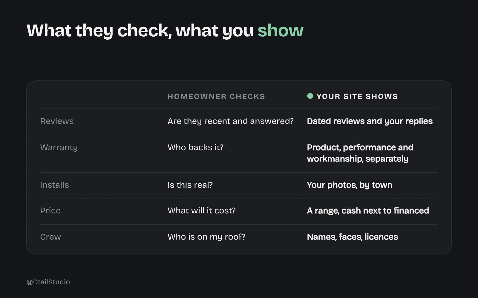
Five checks homeowners make and the proof that answers each. Framework by Dtail Studio.
Because a logo says you exist, and a crew photo says you’ll show up. Most homeowners can’t judge an inverter, but they can judge people. A named installer in a clean uniform, next to a neat conduit run on a house that looks like theirs, answers questions a tagline can’t.
A sun with a swoosh isn’t a differentiator. Neither is a leaf, or a bolt, or a leaf shaped like a bolt. Designers, us included, find that one hard to hear.
If you have one branding budget this year, spend part of it on a photographer who follows your crews for a week before you touch the logo. Then make sure the logo reads on a van and a yard sign, and let it get out of the way.
Show a range, show what moves it and put the cash price next to the financed one. Hiding the number doesn’t make it smaller. It just makes people wonder why.
Savings are the whole pitch: in the same EnergySage report, 70% of contractors said customers buy solar to save money. That’s also the claim people doubt most, after years of rosy doorstep promises. Show your assumptions, give a cautious example and say what would make it worse.
Financing needs the same care. EnergySage saw the share of quotes offering leases and power purchase agreements on its marketplace rise from about 14% to about 41% in six months, after the federal tax credit for purchased home systems expired. One plain page comparing owning, leasing and a PPA will do more for trust than any campaign line.
One system that works on a phone screen, a pitch deck and a device in someone’s garage. When we worked with Cubee, an energy management startup, the technology was strong but the visual presence was fragmented. It needed to feel approachable and credible at once, across decks, digital and physical.
The answer was a geometric symbol system built on energy flow and connection, with a bold logomark that balances precision and warmth. Cubee now has 2,000+ installations. “Dtail helped us launch with a brand and product that stood out instantly,” says David Vondracek, Founder and CEO. The Cubee case study shows the system.
The same thinking applies to the screens installers use on site. Our post on energy installer app design covers the part nobody puts in the demo.
We’d start with your reviews and sales calls, and leave the moodboard for later. For a solar or battery company, that usually means:
Read the objections.
Your last few months of reviews, lost deals and call notes, sorted by the doubt behind them.
Build a proof library.
Real install photography, crew profiles, a one-page warranty summary and a plain pricing explainer.
Fix the pages that answer doubts.
Install gallery by town, warranty page, team page and a financing page that compares the options.
Check the identity on the hard surfaces.
Van, yard sign, app icon and the device itself, so it reads at a distance and at thumbnail size.
Bring your reviews, warranty documents, any install photos you have and the five questions homeowners ask most. More on how we work.
Do we need a rebrand to win more installs?
Usually not. Most solar sites lose people on missing proof, not on the logo. Fix reviews, photos, warranties and pricing first.
Should we put prices on our website?
Yes, as a range with what’s included and what changes it. People who see a number and still call are better leads.
What if we use subcontractors to install?
Say so, name them and explain who the homeowner calls if something goes wrong. Finding out on install day feels like a bait and switch.
How many reviews do we need?
Recent ones matter more than a big total. In BrightLocal’s survey, 74% of consumers only care about reviews from the last three months, so ask after every install, not once a year.
Open your website on your phone and pretend you live two towns over. Time how long it takes to find five things: a review from last month, your warranty in plain words, a photo of a real install near you, a price range and the name of who’d be on your roof. Anything you can’t find in 30 seconds is a call that doesn’t happen.
If you’d like a second pair of eyes on what your brand proves, let’s talk.
About the author: Alma Johnson is Content Lead at Dtail Studio and writes about brand strategy, positioning and how founders explain what they do.
Sources: Pew Research Center, Americans’ perceptions of solar power in their own lives (June 2024), CFPB, Report finds lenders cramming markup fees and confusing terms into solar energy loans (August 2024), EnergySage, 23rd Intel Home Electrification Marketplace Report, H1 2026 (September 2026), BrightLocal, Local Consumer Review Survey 2026 (February 2026)
A wellness brand design agency view on selling to clinics and consumers: what changes in tone, proof and packaging, and what must stay the same.

Women’s health app design mistakes: hidden privacy, pink clichés, one kind of user and narrow life stages. What to do instead.

Patient monitoring dashboard design: build the screen around the number patients check first, design the low result first and show who acts next.