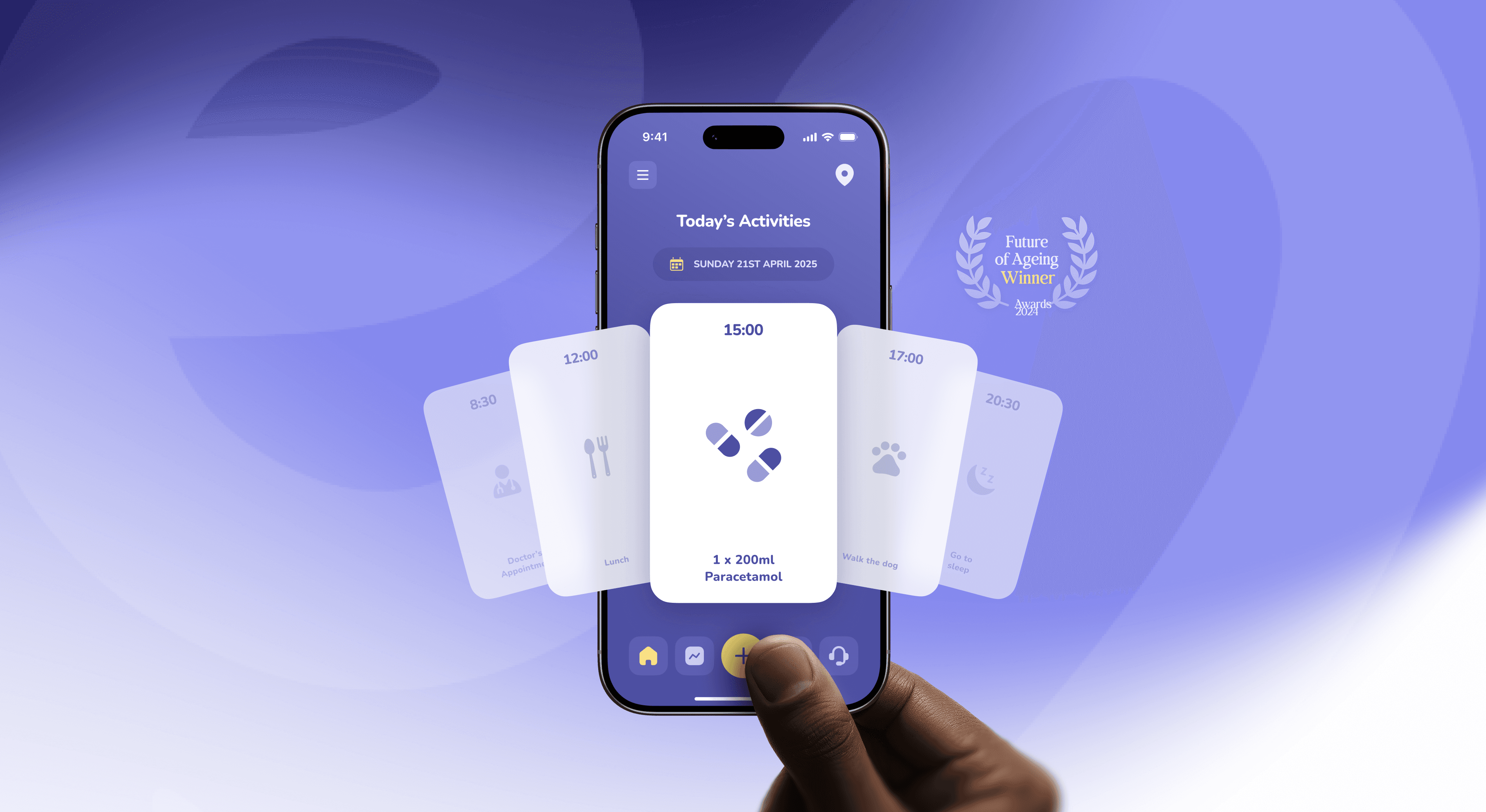
Designing tech for older adults that doesn’t feel like a pill box
How to design apps for older adults that are accessible and dignified, not patronising. Principles, a swap table and lessons from the Elli Cares app.
3 Nov 2026
People underestimate their energy use by 2.8 times. Six UX patterns that make energy management apps clear, useful and worth opening twice.
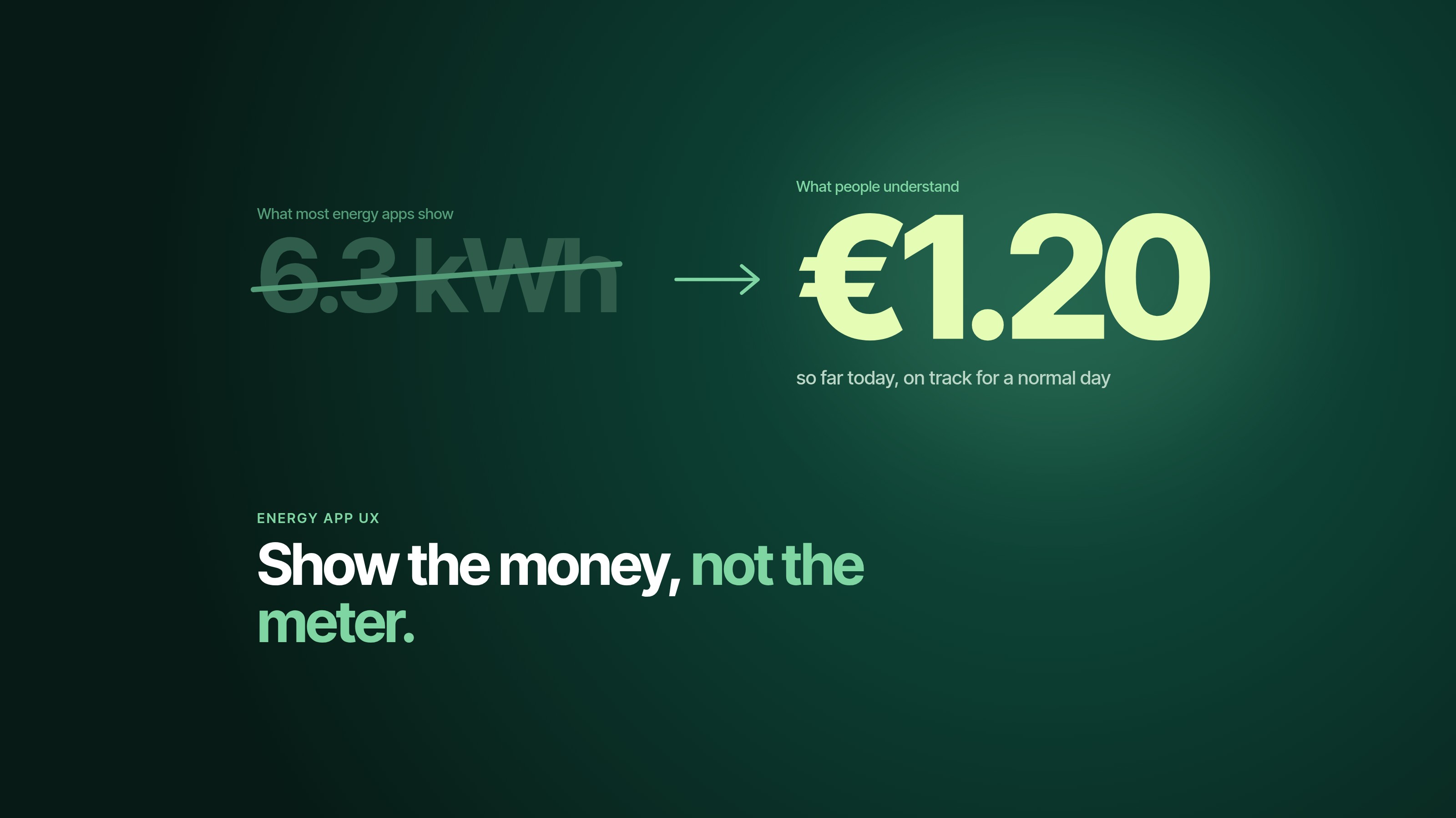
Translate energy into money, time and things people recognise. The first screen should answer “am I okay?”, the second “why?”, and the third “what should I do?”. Show one number that matters right now, compare people to themselves rather than to strangers, and keep kilowatt-hours one tap away for the people who love them.
Quick test. How much energy does your dishwasher use compared to your laptop? Your fridge compared to your kettle?
If you hesitated, you’re in good company. In a study published in PNAS, 505 people underestimated the energy use of everyday activities by a factor of 2.8 on average, and the bigger the appliance, the bigger the miss. Nearly 20% said switching off lights was the most effective way to save, while very few mentioned efficient appliances or insulation.
Now imagine building an app for those people and opening it with a line chart in kWh. That’s most energy apps.
At Dtail Studio, a Barcelona design studio working with renewable energy and HealthTech startups, we designed the brand and product for Cubee (case study), an energy management startup now past 2,000 installations. These are the patterns we rely on.
Energy is invisible, abstract and billed weeks after you use it. The feedback loop is broken before the app even opens.
There’s a second problem. Most energy products are built by engineers, for whom kWh is a perfectly normal word. For everyone else it’s like reading a nutrition label in joules.
Am I okay? One glance. Status in a colour and a word.
Why? What changed: the weather, the heat pump, the car charging overnight.
What should I do? One concrete action, or permission to do nothing.
If the home screen can’t answer the first question in two seconds, nothing else on it matters. (It’s the same test we start every dashboard audit with.)
Lead with money or time, not kWh. “€1.20 today” or “Battery lasts until 21:40” beats “6.3 kWh”. Keep the kWh, just not as the headline.
Compare people to themselves. “18% less than last Tuesday” is personal and fair. “You use more than 62% of homes like yours” mostly makes people close the app.
Use units people already own. “Running the washing machine now costs about €0.40. After 14:00, about €0.12.” That’s a decision someone can make.
Show flow, not tables. Where energy comes from and where it goes: panels, home, battery, grid. A simple animated flow explains a whole system in one look.
One action a day, at most. An energy app that nags gets muted. Save notifications for money, outages and anything that needs a decision today.
Make status glanceable outside the app. A widget or lock screen card does more for engagement than any redesign of the home tab.
Instead of “6.3 kWh consumed today”, show “€1.20 so far today, on track for a normal day”.
Instead of “4.1 kW solar production”, show “Your panels are covering everything right now”.
Instead of “Battery state of charge 64%”, show “Battery lasts until 21:40”.
Instead of “Grid export 2.2 kWh”, show “You earned €0.18 from the grid today”.
Instead of “Peak tariff 17:00 to 21:00”, show “Run the dishwasher after 21:00 to save about €0.30”.
All figures above are illustrative. Use your users’ real tariffs.
Give them their own view, not a cluttered version of everyone else’s. A simple “details” layer for homeowners who like numbers, and a proper pro view for installers with diagnostics, history and raw data.
Installers are often the first people to show a homeowner your app. If they can’t explain it in a minute, nobody can. We’ll go deeper on that in an upcoming post about B2B2C design in renewable energy.
Cubee’s identity is built on a geometric system that suggests energy flow and connection. That idea doesn’t have to stop at the logo. When the brand is about flow, the product can show flow, and the whole experience starts to make sense as one thing.
That’s the real advantage of designing brand and product together: the app explains what the brand promises. If you’re earlier in the process, start with how to brand a clean energy startup without leaves, lightning bolts or green.
“Dtail helped us launch with a brand and product that stood out instantly.” David Vondracek, Founder and CEO, Cubee
Yes, one level down. Engineers, installers and enthusiasts want it. Everyone else needs money, time and a clear status first.
Bars by hour or day for consumption, because people compare bars easily. A flow diagram for live production and use. Avoid pie charts for anything that changes through the day.
Give them a reason that is about them: a cost alert, an outage warning, a weekly summary that shows what they saved. Daily nudges without a reason train people to ignore you.
Light touches work, like a monthly saving compared to last year. Leaderboards against neighbours are riskier: they can leave heavy users feeling judged and give light users permission to relax.
Show your home screen to someone outside the industry for five seconds. Ask one question: “Is everything okay?” If they can’t answer, the screen isn’t done yet.
Working on an energy product? We’re always up for a kilowatt-hour chat.
About the author. Slavena Vasileva is a partner and brand strategist at Dtail Studio, a senior brand and product design studio in Barcelona working with HealthTech and renewable energy startups. 16+ years, 300+ products, 5.0 on Clutch.
Sources: Attari et al., PNAS 2010 · ScienceDaily summary of the study · Cubee case study
How to design apps for older adults that are accessible and dignified, not patronising. Principles, a swap table and lessons from the Elli Cares app.

Energy investors read a climate deck differently. What they look at first: technology readiness, unit economics, real installs and impact with a method.

Patients want independence, carers want reassurance. How to design one health app that serves both without turning care into surveillance.