Designing tech for older adults that doesn’t feel like a pill box
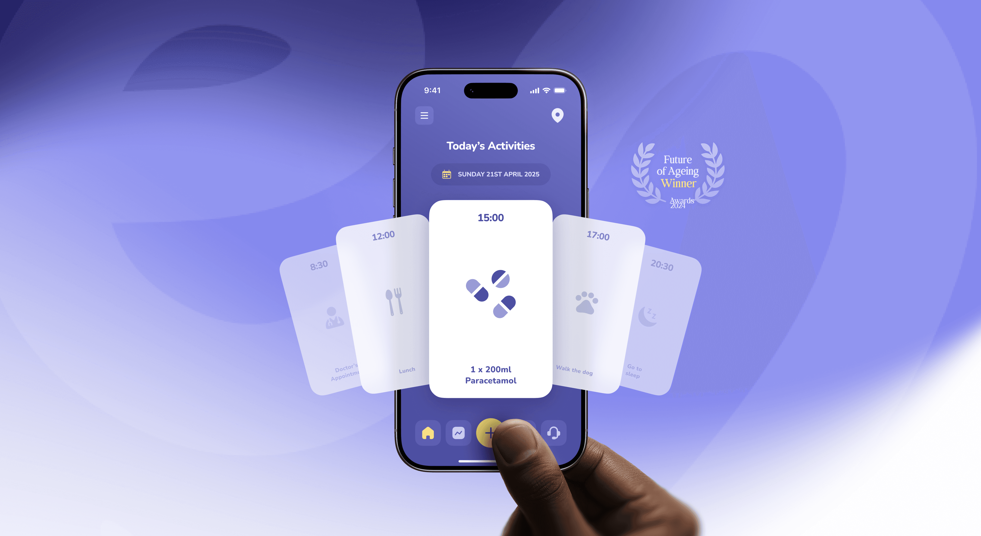
How to design apps for older adults that are accessible and dignified, not patronising. Principles, a swap table and lessons from the Elli Cares app.
20 Oct 2026
Most renewable energy brands look the same from two metres away. A five-step way to brand a clean energy startup that people remember, from the studio behind Cubee.

Brand the outcome your customer feels, not the physics behind it. Start from the one job your product does in someone’s day, build a symbol from how your product works rather than from the category, choose colours by looking at what competitors already own, and design for the hardest surface first: a sticker on a grey box in a garage.
Search “renewable energy logo” and you’ll get a leaf, a sun, a wind turbine, a lightning bolt, or a leaf with a lightning bolt inside it. Sometimes in a circle, for extra sustainability.
The category has converged so hard that most clean energy brands are interchangeable from two metres away. That’s a real problem, because energy startups sell to at least three audiences at once:
Homeowners and businesses who want lower bills and zero hassle.
Installers and partners who need to trust the hardware and explain it in a 20-minute site visit.
Investors who need to believe in the team, not just the category.
A leaf speaks to none of them in particular.
Because they brand the category instead of the company. A leaf says “energy, but nice”. So does every competitor’s leaf.
It usually happens for understandable reasons. The founders are engineers, the brand is done in a week before a raise, and the safest move seems to be looking like everyone else who got funded. Safe, in this case, means forgettable. (The good news: your brand already exists, you just haven’t met it yet.)
Control, reliability and simplicity. Most people don’t want to think about energy. They want to stop worrying about it.
People also understand energy less than we assume. In a study published in PNAS, 505 Americans underestimated how much energy everyday activities use by a factor of 2.8 on average. Nearly 20% named switching off the lights as the most effective thing they could do, while very few mentioned efficient appliances or insulation.
So a brand that assumes energy literacy, with kilowatts in the headline and a battery chemistry diagram on the homepage, is talking to a few hundred engineers. A brand that says “your home runs on your own sun first, and you can see it” is talking to everyone else. The same rule applies inside the product, which we cover in how energy apps make kilowatt-hours make sense.
Cubee is an energy management startup. Their technology was strong, but their visual presence was fragmented, and it didn’t reflect the clarity they wanted customers and partners to feel. The brand had to feel approachable without losing credibility, and it had to work on a pitch deck, in an app and on physical hardware.
Over four months in 2024 we built:
A geometric symbol system based on energy flow and connection, instead of the usual sun or leaf.
A bold logomark that balances precision with warmth.
Grid logic and typography that make complex information feel simple.
A system flexible enough for product screens, packaging and investor decks.
Cubee has since passed 2,000 installations. See the full case study.
“Dtail helped us launch with a brand and product that stood out instantly.” David Vondracek, Founder and CEO, Cubee
Write the promise in your customer’s words. One sentence, no units. If it needs “kWh”, it’s a spec, not a promise.
Find your symbol in your mechanism. How does your product actually work? Flow, storage, balance, timing, sharing? That shape is yours. The sun belongs to everyone.
Choose colour by mapping competitors. Put ten competitor logos on one page. If eight are green or blue, you have your answer. If you still want green, own one specific green and use it with discipline.
Design for the worst surface first. A sticker on an inverter in a dim garage. A 16px app icon. A dark investor deck on a bad projector. If the brand works there, it works anywhere.
Make the product part of the brand. App screens, packaging, the install guide, the first bill. A brand that stops at the logo stops being trusted at the unboxing. Building a system that flexes this far is its own skill: here’s how we approach brand versatility.
Leaf says “we’re eco”. Try instead: a shape taken from how your product works.
Lightning bolt says “power”. Try instead: a motion or flow system you can animate in the product.
Sun says “solar”. Try instead: light and time of day expressed in the interface.
Green and blue gradient says “sustainable tech”. Try instead: a colour you own, chosen against your competitor map.
Stock family on a roof says “happy customers”. Try instead: real installations, real numbers.
Yes, when it’s a decision rather than a default. The problem was never green. It’s the green you picked because you didn’t pick anything.
Cubee’s project, covering strategy, identity, packaging and product design, ran from January to April 2024. A smaller identity-only project is shorter. The timeline depends more on how many surfaces the brand has to work on than on the logo.
The core should be the same. The emphasis changes: B2B buyers want proof of reliability and support, consumers want simplicity and savings. One system, two tones of voice.
You need a clear one. Investors fund confidence, and a coherent deck, website and product demo signal that the team can make decisions. A full packaging system can wait until you ship hardware. More on what investors want to see at every stage.
Consistency across every touchpoint, real numbers instead of claims, and a product that looks as considered as the logo.
Put your logo next to your ten closest competitors and step back two metres. If you can’t find yours in three seconds, your customers can’t either.
Branding something in renewable energy? We’d love to hear about it.
About the author. Slavena Vasileva is a partner and brand strategist at Dtail Studio, a senior brand and product design studio in Barcelona working with HealthTech and renewable energy startups. 16+ years, 300+ products, 5.0 on Clutch.
Sources: Attari et al., PNAS 2010 · ScienceDaily summary of the study · Cubee case study
How to design apps for older adults that are accessible and dignified, not patronising. Principles, a swap table and lessons from the Elli Cares app.

Energy investors read a climate deck differently. What they look at first: technology readiness, unit economics, real installs and impact with a method.

Patients want independence, carers want reassurance. How to design one health app that serves both without turning care into surveillance.