
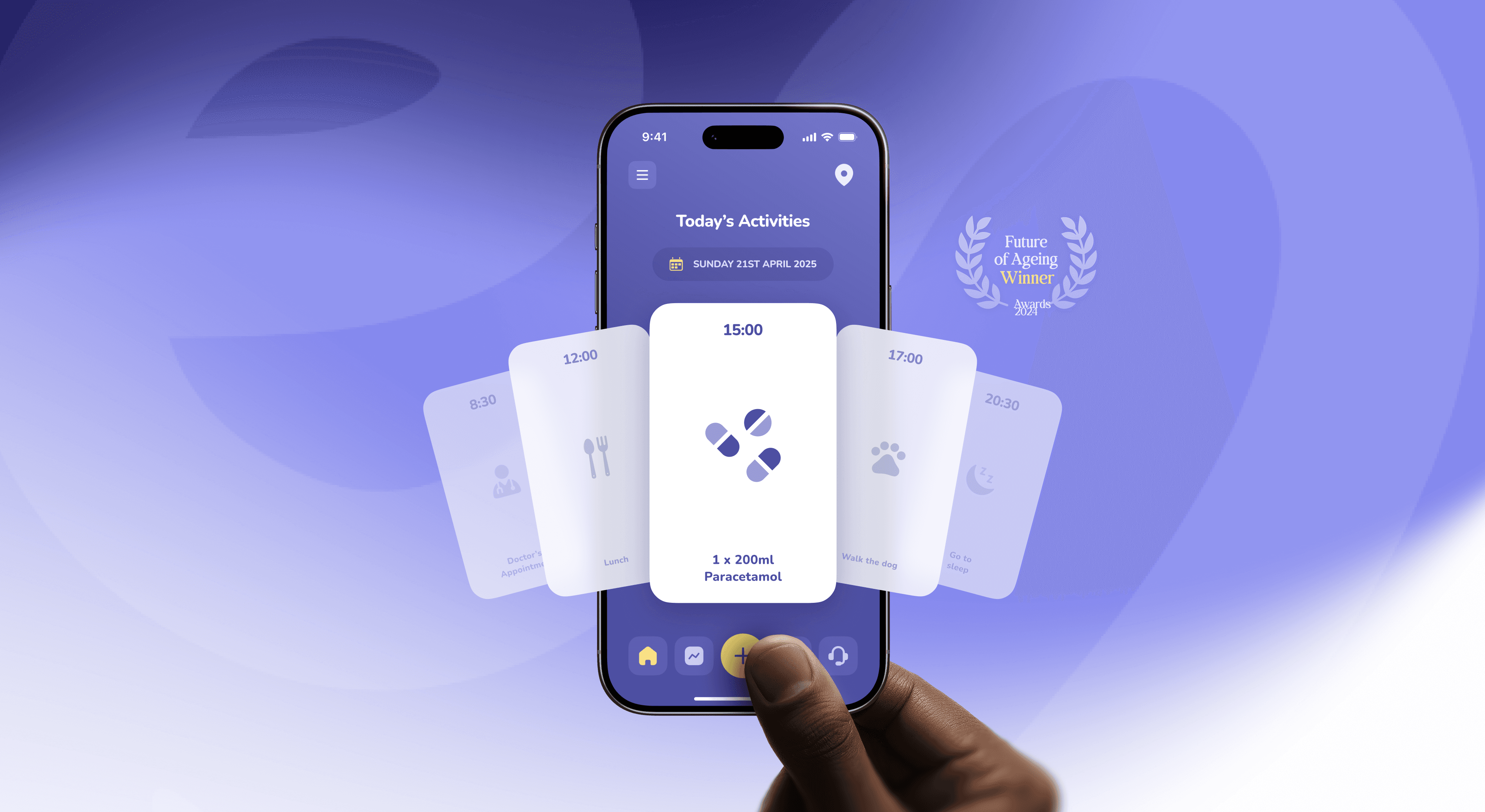
Designing tech for older adults that doesn’t feel like a pill box
How to design apps for older adults that are accessible and dignified, not patronising. Principles, a swap table and lessons from the Elli Cares app.
10 Nov 2026
Patients want independence, carers want reassurance. How to design one health app that serves both without turning care into surveillance.

Design two connected experiences, not one app with an admin panel. The person receiving care needs simplicity and dignity. The carer needs overview and reassurance. Agree what each side can see, make sharing visible to both, default to the least intrusive option and plan for abilities that change over time.
Family and friends who care for someone living with dementia spend about 5 hours a day on it, according to WHO figures for 2019. Many of them also have jobs, children and a phone that never stops buzzing.
So when a health app adds a “family” feature, it’s really designing for a second, exhausted user with very different goals. Get it wrong and you build either a toy for the patient or a tracking tool for the family. Neither stays installed.
At Dtail Studio, a Barcelona design studio working with HealthTech and renewable energy startups, we redesigned the Elli Cares app (case study), which helps people with cognitive impairment live independently while keeping their families informed. Most of what we learned comes down to one idea: two users, one shared truth.
Because they open the app for opposite reasons. The person receiving care wants to get on with their day. The carer wants to know that the day is going okay. One needs fewer things on screen. The other needs more.
Main goal. Person receiving care: do things on their own. Carer: know they’re okay without hovering.
Time in app. Person receiving care: seconds, a few times a day. Carer: a quick check, plus moments of worry.
Ideal screen. Person receiving care: one task, big and clear. Carer: an overview with exceptions highlighted.
Tone. Person receiving care: warm, encouraging, never bossy. Carer: calm, factual, never alarming.
Biggest fear. Person receiving care: losing independence. Carer: missing something important.
Separate modes, shared truth. Each person gets an interface built for them, but both read from the same data. When the medication is marked as taken, everyone sees the same fact.
Default to the least intrusive option. “Arrived at the pharmacy” is usually enough. A live dot moving on a map is not always necessary, and it changes how the relationship feels.
Make sharing visible on both sides. The person being supported should always see what is shared and with whom. The carer should see what they can’t see, so silence isn’t mistaken for a problem.
Write every event for two readers. The same moment can need two messages. For the person: “Nice walk. You’re home.” For the carer: “Mum got home at 11:42.” This is where small words make a big difference.
Plan for change. Abilities shift over months, sometimes days. Settings should be easy to adjust together, without starting over or calling support.
As much as possible, the person receiving care. When that isn’t possible, make changes visible and explained. A setting that changes quietly on someone’s phone breaks trust faster than any bug.
This is where good health UX and good ethics meet. We covered the regulatory side in why HIPAA, MDR and accessibility make healthcare UI better. The human side is simpler to say and harder to design: nobody likes being managed.
A carer who gets 30 notifications a day stops reading them, and then misses the one that mattered. Treat their attention as something you’re borrowing.
Group routine updates into a daily summary.
Interrupt only for things that need action now.
Offer quiet hours, and respect them.
Let several family members share the load, each with their own role and alerts.
The Elli App supports people with early to mid-stage dementia with reminders, scheduling, mood tracking and navigation support, while families get real-time updates and an AI-powered resource centre with personalised guidance. Our redesign focused on simpler flows and higher contrast for the person, and clearer communication between them and their family. The person-side principles are in designing an app for people living with dementia.
“Working with Dtail felt like having a senior team that truly cared about results and users.” Angela Edwards, CEO, Elli Cares
Some, with the person’s knowledge. Remote changes should be visible on the patient’s side and easy to undo. Hidden changes damage trust.
More than one. Care is usually shared between family members, friends and professionals. Give each person a role with its own permissions and notifications.
It can be, when it is consented to, visible to the person being located, limited to a clear purpose and never the default for everything. Start with events, like arriving or leaving a place, before live tracking.
Building the carer view as an admin dashboard. Carers aren’t administrators. They’re family members checking in between everything else in their day.
Map one ordinary day from both sides: the person’s and the carer’s. Mark every moment where one of them is guessing what the other is doing. Those moments are your product.
Building for patients and families? We’d be glad to help map that day.
About the author. Slavena Vasileva is a partner and brand strategist at Dtail Studio, a senior brand and product design studio in Barcelona working with HealthTech and renewable energy startups. 16+ years, 300+ products, 5.0 on Clutch.
Sources: WHO dementia figures via NIHR Dementia Researcher · Inside Ageing on Elli Cares · Elli Cares case study
How to design apps for older adults that are accessible and dignified, not patronising. Principles, a swap table and lessons from the Elli Cares app.

Energy investors read a climate deck differently. What they look at first: technology readiness, unit economics, real installs and impact with a method.
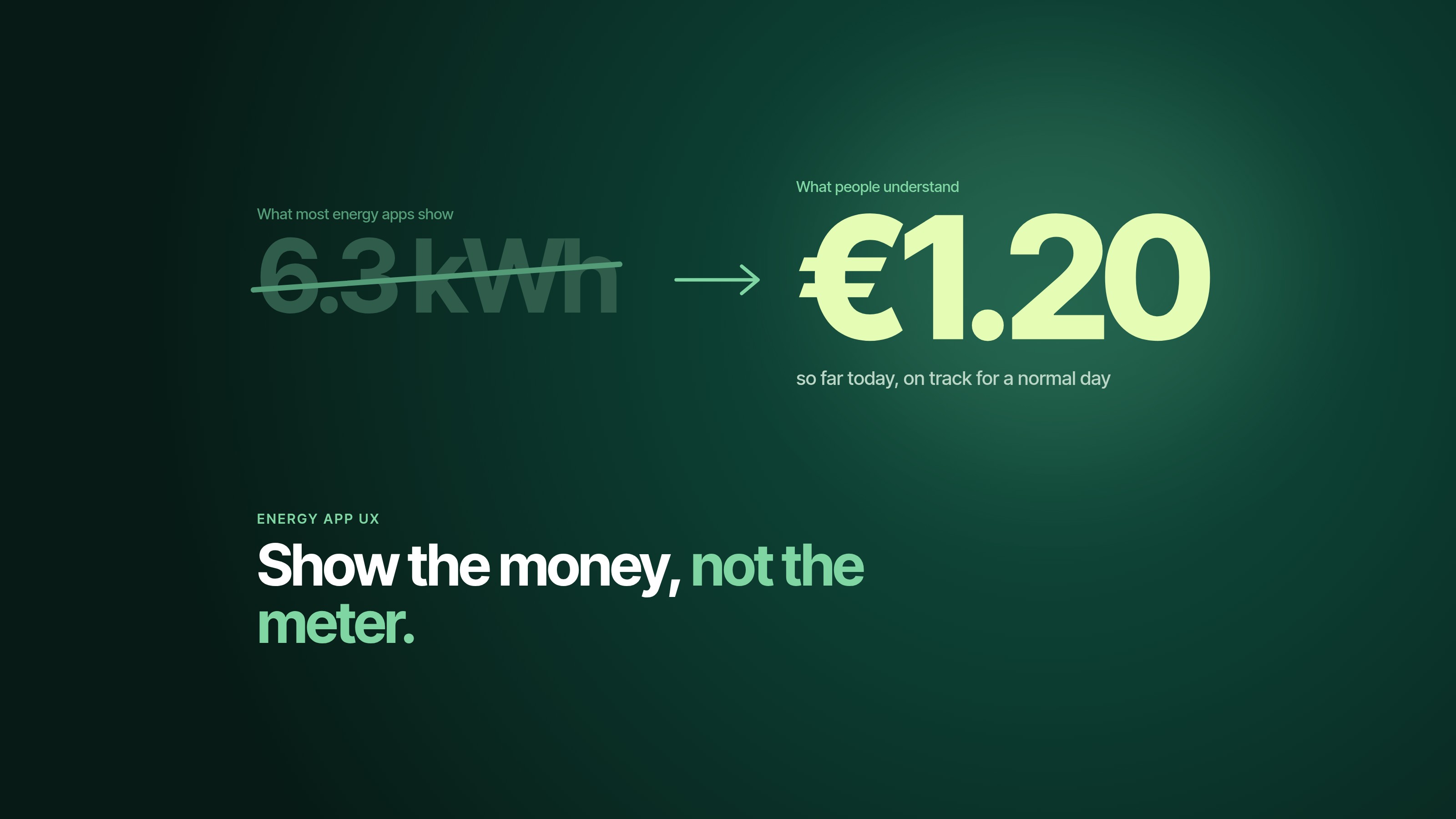
People underestimate their energy use by 2.8 times. Six UX patterns that make energy management apps clear, useful and worth opening twice.