

Climate tech pitch decks: what energy investors look at first
Energy investors read a climate deck differently. What they look at first: technology readiness, unit economics, real installs and impact with a method.
15 Dec 2026
How to design apps for older adults that are accessible and dignified, not patronising. Principles, a swap table and lessons from the Elli Cares app.
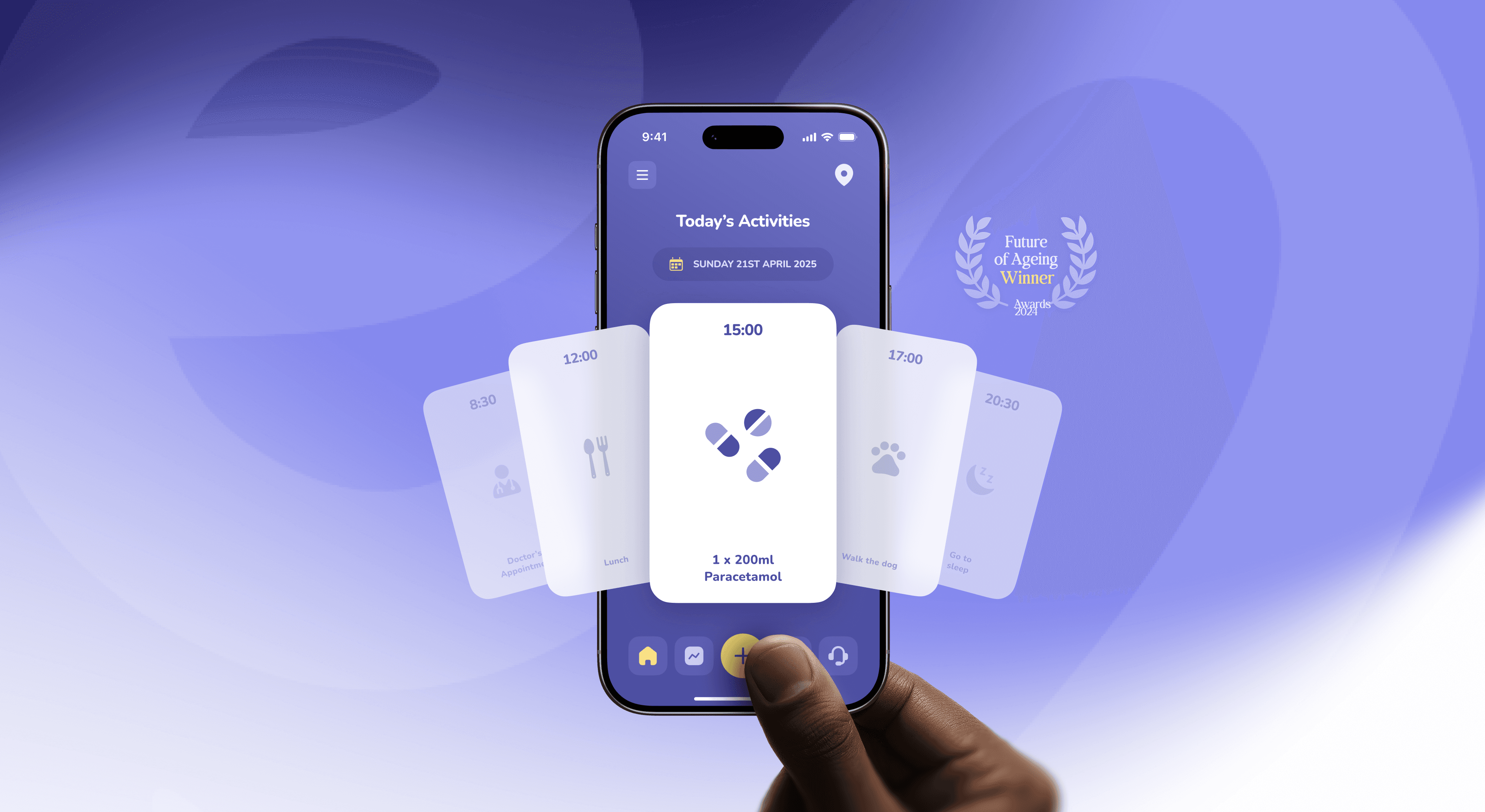
Design for older adults as capable adults with specific needs, not as patients. Make text large, contrast high and targets generous by default, then make it look like something anyone would choose to own. Skip the “senior mode”, the baby talk and the beige. Test with older people at home, and leave them in charge.
Picture a weekly pill organiser. Seven plastic boxes, one bright colour each, letters big enough to read across a room. It does its job. Nobody has ever been proud to own one.
A lot of technology for older adults looks exactly like that. Huge buttons, three colours, a font that seems to apologise for itself. Usable, in a narrow sense. And quietly telling the person holding it that this is what you get now.
That’s a design problem with a large audience. The World Health Organization expects that by 2030, 1 in 6 people in the world will be aged 60 or over, and that the number will reach 2.1 billion by 2050. They are not new to screens either: 78% of US adults aged 65 and over own a smartphone, according to Pew Research Center’s 2025 survey.
At Dtail Studio, a Barcelona design studio working with HealthTech and renewable energy startups, we learned a lot about this redesigning the Elli Cares app (case study). We’ve written separately about designing for people living with dementia. This post is about older adults in general: people who may see less sharply or tap less precisely, and who mostly want technology that respects them.
Because they are designed for an age instead of for a set of needs. Age becomes a persona, the persona becomes a stereotype, and the stereotype becomes beige.
Designers are not immune to this. A WHO-led global report found that one in every two people surveyed held moderately or highly ageist attitudes. Some of those people write product briefs. You can usually spot it in the brief itself: “simple”, “easy”, “not too techy”, and a reference image of a grandparent being shown a tablet by a grandchild.
Older adults are the most varied group you will ever design for. A 64-year-old engineer and a 91-year-old with arthritis share an age bracket and almost nothing else. Design for the specific needs you find, not for the number on the birth certificate.
Mostly what everyone needs, turned up. Vision, hearing, dexterity and reaction time change with age, and they change at different rates for different people. Good accessibility handles most of it:
Readable type by default. Larger body text, real line spacing, and layouts that hold up when someone sets their phone’s text size to the maximum.
High contrast. Treat WCAG 2.2 AA as the floor, not the goal, especially for the main action on each screen.
Generous targets and spacing. So a slightly unsteady tap lands where it was meant to.
Plain words. “Send photo” rather than an icon you have to remember. Labels next to icons.
Patience. No timeouts that log people out mid-sentence, no toasts that vanish before they are read.
Stability. Things stay where they were yesterday. Updates that move the main button are small betrayals.
None of this needs to look clinical. It needs to look intentional.
Use the same craft you would put into any premium product. Real typography with character, a colour palette with a point of view, photography of older people doing things rather than receiving care.
Large type can look confident. High contrast can look bold rather than medical. The difference between a pill box and a beautiful object is often not the size of the buttons. It’s whether anyone cared about the proportions, the materials and the tone of voice.
A useful brief: would someone who is 35 happily use this? If the answer is no, something in the visual language is saying “for old people”, and the people it’s for will hear it too.
Usually not. One well-designed interface with good settings beats two versions of the product. A separate mode tells people they are a special case. It also splits your team’s attention, so the “simple” version quietly falls behind.
Respect the accessibility settings people already use on their phone, such as text size, bold text and reduced motion, and make sure your app follows them. Offer a few clear personal settings inside the product, and let people change them without hunting.
Keep the person in control and speak to them as an adult. Many products for older adults involve family: shared calendars, location, check-ins. Done badly, they turn a parent into a monitored object.
Let the older person see what is being shared and with whom, and let them change it. Write reminders that inform rather than scold. “Your appointment is at 11:00” works. “Don’t forget!” with three exclamation marks does not. We’ve written about why small words carry so much weight, and about designing for patients and the families who care for them when two people use the same product for different reasons.
In their own homes, on their own devices, across a wide age range. Recruiting only through care homes gives you a narrow slice. Recruit through clubs, libraries, family networks and existing customers too.
Watch more than you ask, because politeness hides a lot of friction. And test with the phone set up the way they actually use it, with their text size, their case and their reading glasses, wherever they left them.
Giant buttons, nothing else on screen. What it says: “You can’t handle more”. Product move: Large targets inside a well-composed layout.
Beige, grey and one primary colour. What it says: “Function only”. Product move: A palette with personality and strong contrast.
Stock photo of a nurse holding a hand. What it says: “You are a patient”. Product move: Real older people doing real things.
“Easy mode” or “senior mode”. What it says: “You are a special case”. Product move: One interface that respects system settings.
Exclamation marks and “Don’t forget!”. What it says: “We don’t trust you”. Product move: Calm, specific, adult language.
Family sees everything by default. What it says: “You are being watched”. Product move: Visible, editable sharing controlled by the user.
Elli Cares supports independent living for people with cognitive impairment and gives their families peace of mind. When we started in November 2023, the app carried high cognitive load, low contrast and unclear hierarchy. For an older user, every one of those turns a quick task into a chore.
We designed the website, platform and app: simpler flows, a high-contrast interface and a calm visual language, across reminders, mood tracking, scheduling, location and communication with family and carers. The goal was an app that felt supportive without feeling clinical.
The Elli App is now used in 19 countries. It was a joint winner of the 2024 Future of Ageing Award in the Technology Consumer category, and it is nominated for the 2026 SilverEco and Ageing Well Awards. That recognition belongs to the Elli Cares team. Our part was making sure the design never got in the way.
“Working with Dtail felt like having a senior team that truly cared about results and users.” Angela Edwards, CEO, Elli Cares
The WHO generally uses 60 and over. In practice, design for needs rather than age, because the range inside that group is huge.
Start larger than you would for a general audience, but the real test is the phone’s own text size setting. If your layout breaks at the largest size, fix the layout.
Many do, and voice can remove a lot of friction. It works best as an option alongside the screen, not a replacement. We’ve written about voice assistants that feel human.
Avoid hidden ones. Any gesture should also have a visible button that does the same thing.
Take your three most important screens and imagine a 72-year-old using them on a busy train. Would they be happy for the person next to them to see the screen? Would they be able to read it without taking off their sunglasses? If the honest answer to the first is no, fix the look. If it’s no to the second, fix the type.
Building something for older adults? We’re always happy to compare notes.
About the author. Slavena Vasileva is Brand Strategist and Partner at Dtail Studio, a senior brand and product design studio in Barcelona working with HealthTech and renewable energy startups. 16+ years, 300+ projects, 5.0 on Clutch.
Sources: WHO Ageing and health fact sheet · WHO, Ageism is a global challenge · Pew Research Center Mobile Fact Sheet · WCAG 2.2 · Elli Cares case study
Energy investors read a climate deck differently. What they look at first: technology readiness, unit economics, real installs and impact with a method.

Patients want independence, carers want reassurance. How to design one health app that serves both without turning care into surveillance.
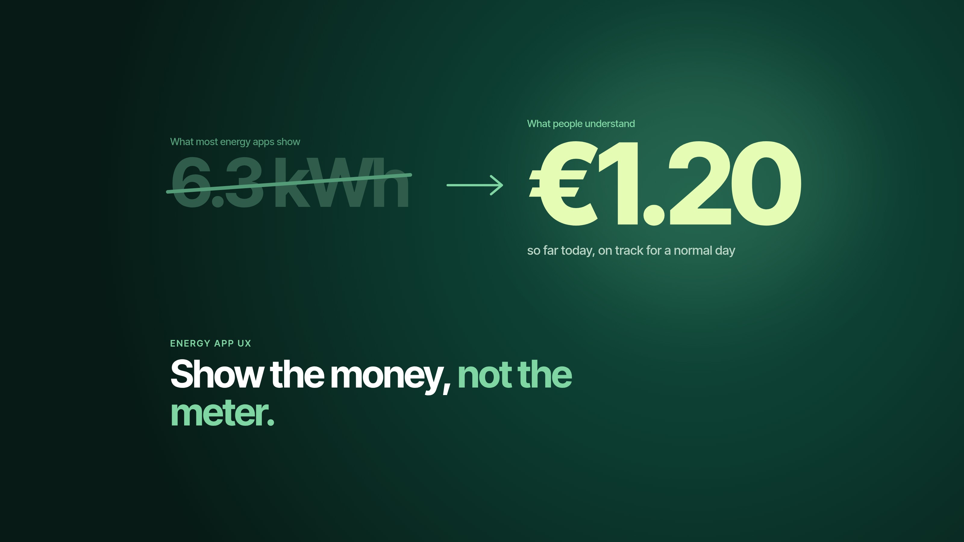
People underestimate their energy use by 2.8 times. Six UX patterns that make energy management apps clear, useful and worth opening twice.