

AI health app design: features patients actually trust
AI health app design for founders: where AI belongs, how to show its source and certainty, when a person takes over, and what to leave out.
28 Oct 2026
When does a SaaS website redesign pay off? Five signs to check, what to fix first, and when a full redesign wastes a quarter.

Redesign your SaaS website when it no longer matches who you sell to, what you sell or how buyers check you out. Five signs tell you. Most are fixed by a better headline, pricing page, proof and demo path. A full redesign earns its keep for a new market, a new product story or a site nobody can edit.
An illustrative scene. A head of operations in Manchester asks an AI assistant for tools like yours. You come up third. She clicks through, opens pricing, finds “Contact us” and closes the tab.
It happens a lot. In a Semrush survey of 643 US B2B professionals, published in July 2026, 71% of those who use AI for work said they visit a vendor’s website after AI recommends it, and 63% search for the company on Google. The AI makes the introduction. Your site does the vetting.
Many would skip the rep altogether. Gartner found 61% of B2B buyers prefer a buying experience without a sales rep. So the site matters. The real question is whether it needs a rebuild or a fix you can ship this month.
When it describes a company you used to be: a different buyer, an older product or a story your sales team stopped telling. Age isn’t a reason. A three-year-old site that converts beats a shiny one that doesn’t.
If the site misses one thing a buyer needs, that’s a fix. If it misses everything because the business moved on, that’s a redesign.
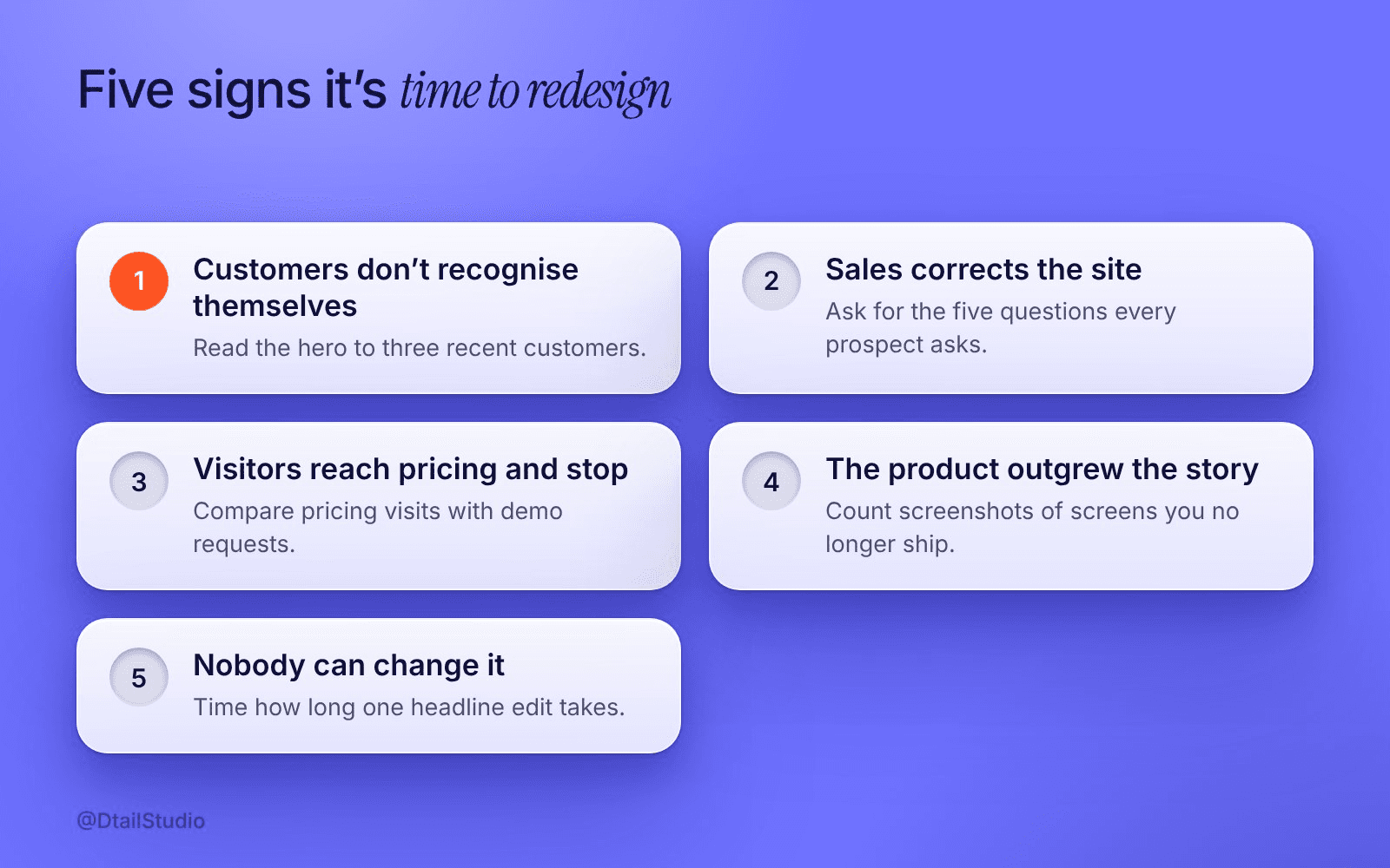
Five signs your SaaS website needs a redesign A summary of this section.
Each sign comes with a check you can run this week, so you decide on evidence rather than taste.
Your best customers wouldn’t recognise themselves.
Read the hero to three recent customers and ask who it’s for. If they describe someone else, you’re still selling to your old segment.
Sales spends the first call correcting the site.
Ask your sales lead for the five questions every prospect asks. If the site answers none, buyers turn up with the wrong idea. Gartner found 69% of buyers report inconsistencies between a supplier’s website and what its sellers say.
Visitors reach pricing and stop.
Compare pricing page visits with the demo requests or sign-ups that follow. Healthy traffic and a quiet next step usually point to the page, not the market.
The product has outgrown the story.
Count the screenshots of screens you no longer ship, and the deal-winning features the site never mentions.
Nobody can change it.
Time how long one headline edit takes. If it needs a developer and a sprint, the site will always lag behind your sales deck.
One or two signs means a fix. Four or five, especially the first and fourth together, means a redesign.
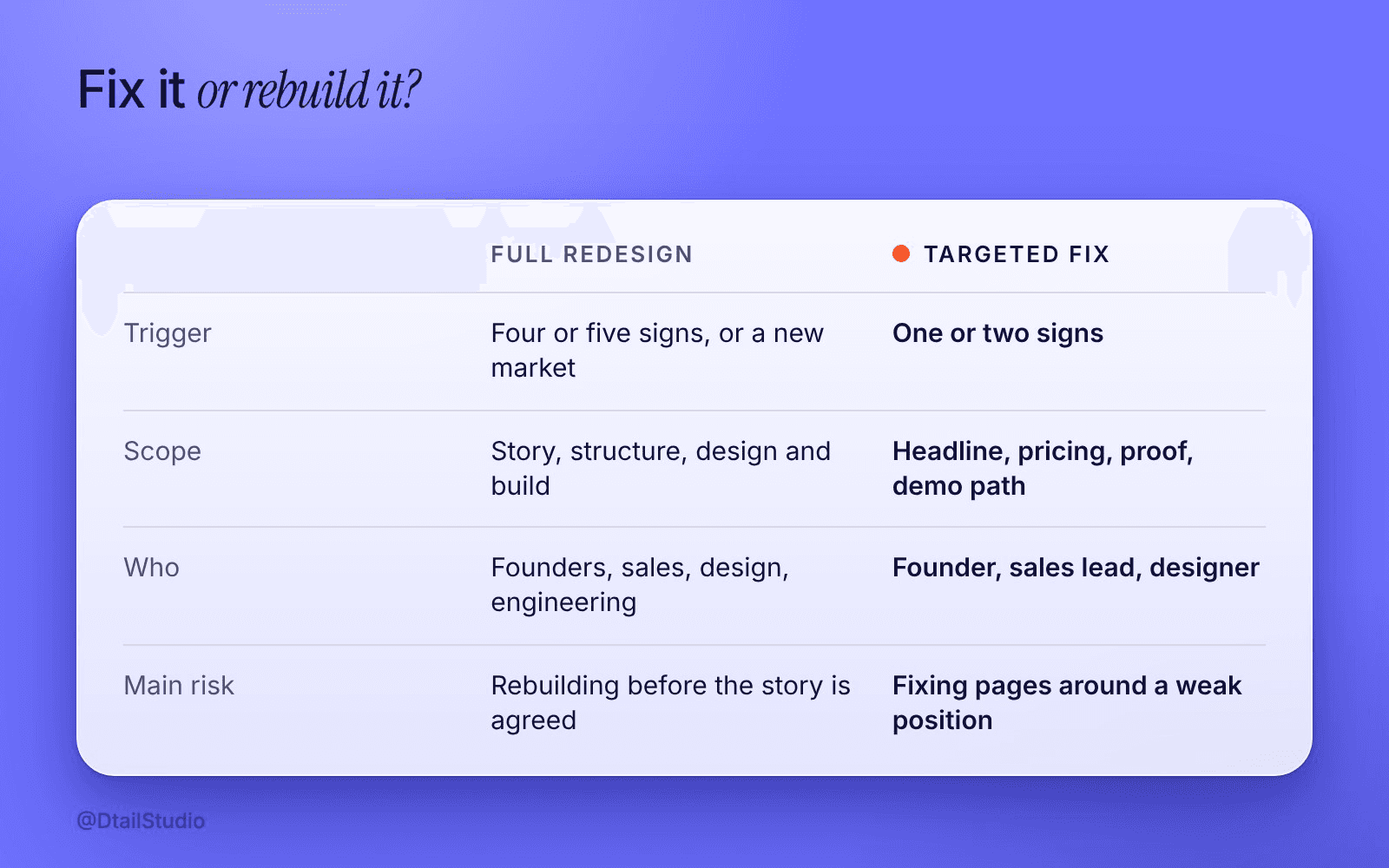
A targeted fix versus a full redesign. Framework by Dtail Studio.
The headline, the pricing page, the proof and the demo path, in that order. They’re a small part of the site and most of what buyers read.
The headline.
One outcome for one buyer, in your customers’ words. Our post on why startup websites explain too much has the eight-second test.
The pricing page.
Buyers want numbers. In TrustRadius research reported by EMARKETER, 45% of B2B tech buyers named pricing transparency as the one change they most want from vendors. Show prices, a recommended plan and your buyer’s currency: USD, GBP and EUR if you sell in all three. Our pricing page audit gives you six questions to test it against.
The proof.
Logos say someone bought. A named customer with a number says why. Put it next to the claim it supports, rather than on a page nobody opens.
The demo path.
From any page, one obvious way to see the product: a short video, a clickable tour or a three-field booking form. If the only door says “Talk to sales”, plenty of buyers will go and take a competitor’s tour instead.
If the site still underperforms after these, you’ve just written your redesign brief.
When the real problem is positioning, not pages. A new site with the old headline is just a nicer-looking way to confuse people.
It’s also poor timing if you’re about to change who you sell to, because you’ll redesign twice. Same if the trigger is a competitor’s launch or a team that’s bored of the gradient. We’re designers, we get bored of gradients professionally. Buyers don’t.
Our advice: write the homepage copy before anyone opens a design tool. If the team can’t agree on the first two lines, the redesign will stall at the hero for weeks. Our three-question clarity test is a good way to settle that argument first.
A redesign is right when the story has changed and the site can’t carry it. Cubee, an energy management startup, had strong technology and a fragmented visual presence, so the brand, packaging and product were designed together to work across decks, digital and physical. The Cubee case study shows how it fits.
Pages specific enough that a buyer can confirm you fit their case in a minute. In the same Semrush survey, 53% said they notice a vendor in an AI answer because it closely matches their use case, and 33% complained that AI recommendations are too generic.
A page per use case or industry, plain pricing and a comparison with the obvious alternative answer that buyer. “The platform for modern teams” doesn’t, mostly because every platform is for modern teams. Our post on website frameworks that convert helps you structure those pages.
We’d start with your sales calls, not your current site.
Listen to recent calls.
Note buyers’ questions and the words they use for the problem.
Run the five checks.
Score the site against each sign and decide: fix or redesign.
Rewrite the headline and pricing page first.
Copy and layout together, shipped on your current site.
Add proof and the demo path.
Named results next to claims, and one clear way to see the product.
Write the redesign brief, if you still need one.
What changes, what stays and how you’ll know it worked.
Bring three call recordings, analytics access and your last lost-deal reasons. More on how we work.
How often should a SaaS company redesign its website?
When the business changes, not on a calendar. Fixes every few months, redesigns far less often.
Should we redesign the website before fundraising?
Only if it contradicts your deck. Investors look, but a clear headline helps more than new visuals.
Can we fix the website without a designer?
The headline and pricing copy, yes. Proof and the demo path usually need design, because they change what the page shows first.
Who should own the redesign?
One founder with the final word on copy, plus whoever runs sales. If you’re hiring help, our guide to choosing a design agency for SaaS covers what to look for.
Ask a friend outside your industry to open your site on their phone. Give them 30 seconds, then ask who it’s for, what it costs and how to see it working. Every wrong or missing answer goes on the fix list. If every answer ends up there, read the five signs again.
If you’d like a second opinion on your fix list, let’s talk.
About the author: Rori Thompson is a Content Writer at Dtail Studio and writes about product design, UX and the details that make an app easy to use.
Sources: Semrush, How AI shapes B2B buying (Margarita Loktionova, July 2026), Gartner, Sales survey finds 61% of B2B buyers prefer a rep-free buying experience (June 2025), EMARKETER, B2B tech buyers crave pricing transparency, citing TrustRadius (Sara Lebow, June 2025)
AI health app design for founders: where AI belongs, how to show its source and certainty, when a person takes over, and what to leave out.

AI SaaS product design that B2B buyers trust: where AI features lose deals, and the sources, undo, limits and admin screens that win them back.

Digital health app design for Europe and the US: one core product with local layers for language, units, dates, consent and trust cues.